using design for positive change with Design Business Council
Recently I was asked by the Design Business Council (DBC) to hold a launch event and judge the submission for their recent campaign “Creatives Make Morrison Understand”. Unfortunately due to the COVID-19 social distancing directive, we were not able to host a physical exhibition but thanks to the quick thinking of Carol and Greg from the DBC, the exhibition was published online and I made a mini video of my judgement with rational and annoucning the winners.
Says Carol from DBC, “At one stage last summer every corner of Australia seemed to be burning. Many of us felt over-awed and unsure of what we could do. Not everyone has the resources to donate cash, the ability to donate time, nor the skills to rebuild fences.
Luckily designers have a special power that many don’t – the ability to translate difficult to understand data into more easily digested, more palatable information. We can use design to help make the complex simple. We can use design to persuade even the most difficult client. So that’s what we asked. We asked Australian creatives to design a poster to persuade the most belligerent client ever – our Prime Minister Mr Morrison – to take immediate action to stem the tide of climate change.”
At Edison, our purpose is “to use design to creative positive change for people, brands and organisations” and I felt especially passionate about contributing to not only the voice of our design community but to the broader nation discourse. When judging the submissions, my role was to focus on selecting a poster that would best work in large format in an outdoor environment as the winner was having their street-poster printed and installed for mass public distribution around Melbourne.
The Brief
- using design to translate difficult climate issues
- making the complex simple
- will persuade a difficult client (Scomo)
- will lead to positive action.
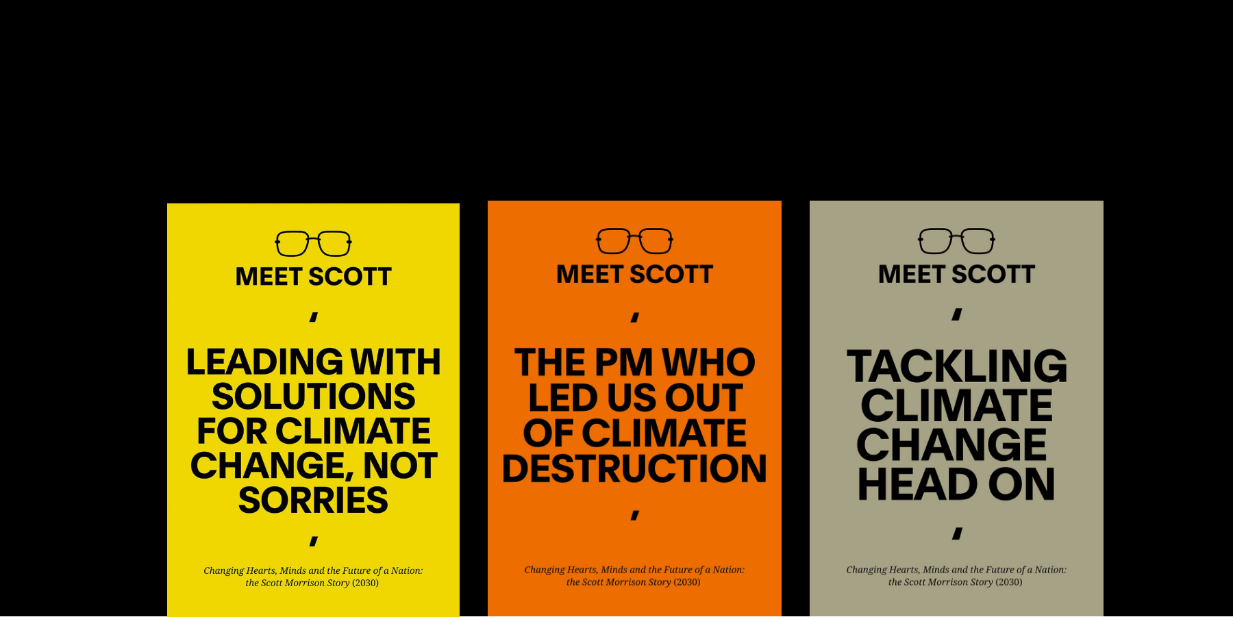
Preference 1 – ‘Meet Scott’ by Portable
Rational – This solution takes real bravery and is not the obvious choice.
The natural position is to point blame and judgement however this solution speaks to the human spirit (and the decision makers ego) with a positive outcome focussed message. The “meet Scott” implies this is a person we have yet to meet or be introduced to, a clever way to appeal to the absence of leadership via assertive simple communication.
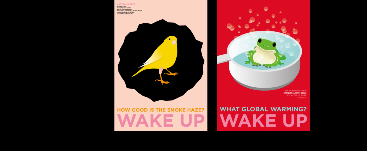
Preference 2 – ‘Canary in the Coalmine’ & ‘Burning Frog’ by Adele Del Signore
Rational – The naivety of the illustration style and subject matter makes the strength of the messaging even more potent.
The juxtaposition between the “Wake Up” headline and the innocence of the animals in forbidding situations creates great tension and appeal. The composition is simple and the viewer does not need to understand the metaphors intuitively in order to understand its intent; very clever with high visual impact at scale.
To see all the amazing submissions and to watch my rationale, click here.
For understand more about how we use to design to create positive change, get in touch with us at
Author: Amber Bonney Head of Strategy @ The Edison Agency
Images: Courtesy of Design Business Council and Portable.