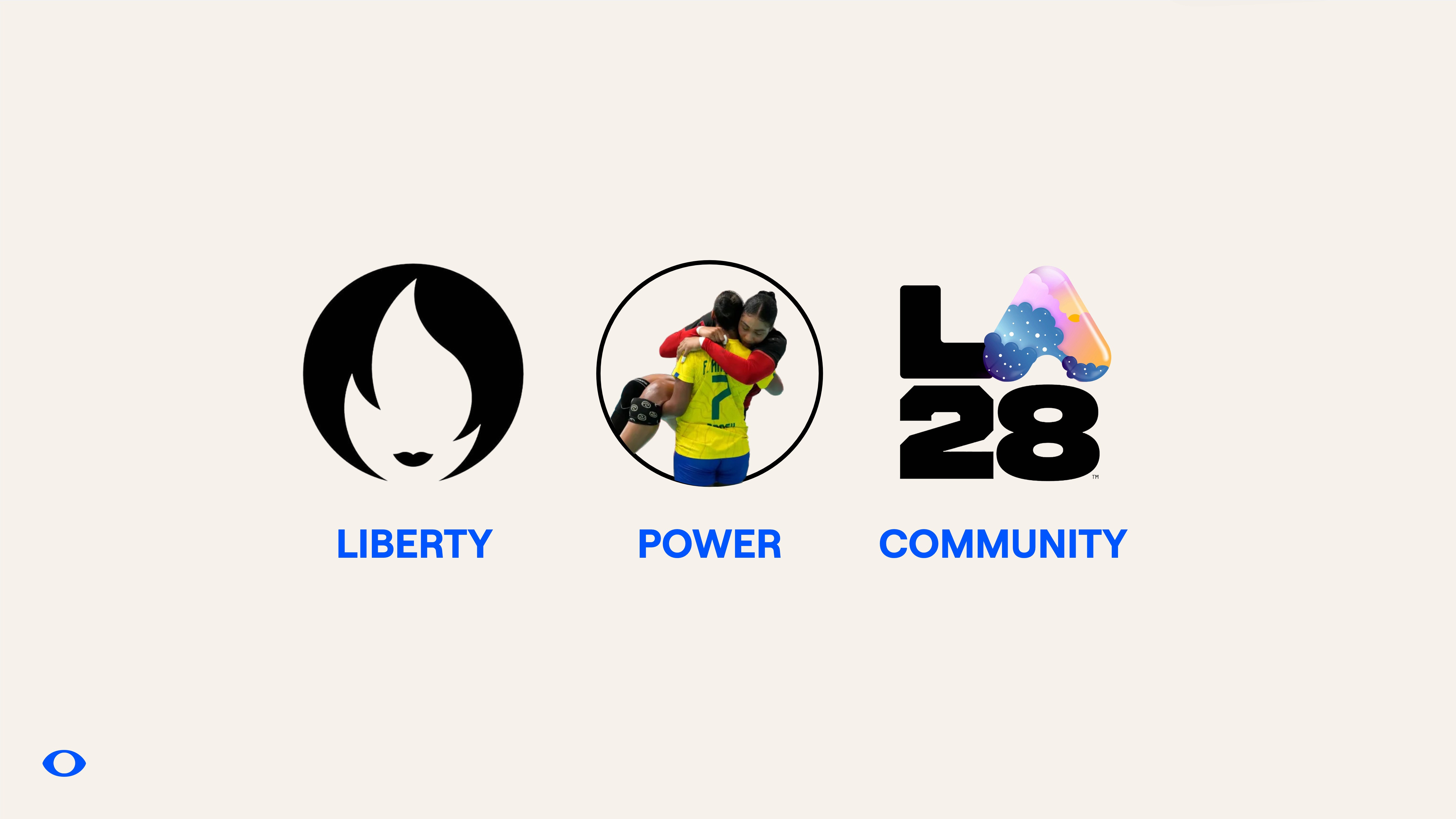

There is a big problem in the way we define the role of branding. I've observed an unhealthy focus on the buzz words and glossy veneers attached to the idea of a "rebrand" that completely misses the point, and the potential. There is a genuine lack of clarity, or a hot mess if you will, about what branding is, how it gets used and how the practice of brand design can be used to manifest positive change right from the start. I see in my own day-to-day practice, client partners overwhelmed by a cacophony of agencies all claiming to be brand experts and vying for influence but we are not all talking the same language, or have the same set of skills to deliver with impact, at the right time.
The 2024 Paris Olympics was a real moment of reflection for me on why these games, compared to any other in recent memory, genuinely felt like a collection of triumphs in human spirit that the world really needed. There were absolutely some some dark reminders of cancel culture, hate rhetoric and excessive indulgences (see NBC's eye watering paid partnership with Snoop Dog), but the enjoyment of the 2024 Paris Olympics was at an all-time high for me. I checked the tally every day. I re-shared memes and sporting achievements in my social stories, I spent hours going down rabbit holes of online research into players I fell in love with from all over the world.
Paris 2024 felt different and I was curious to get under the skin of why by analysing the triggers that made this experience feel good, energising and just better. Here is what I surmised…
Put simply, it came down to two things. A cross-pollination of the pivotal areas of my life that I am most invested in both professionally and as a human.
Gender equity and female empowerment
Powerful design systems
The convergence of these two areas as both a consumer and practitioner are rare but when it happens, it's a beautiful symphony that leaves its mark. For nearly three decades I have dedicated myself to strategic systems and practices that create, break, and remake brands from the inside out. The work and value of which is not just in the designed outcomes, but rather in the process – the conversations, the agitation of the enquiry, the challenging of norms that leads to divergent solutions.
The value is in all those micro moments in the process.
The chats with clients in the lift.
The hyper-focused analysis and research captured with links, post-it notes and archival imagery.
The ideas thrown around at unscheduled meetings.
It’s the bravery in asking "what if?" and to seek to understand what nobody else thought was important.
Because the power is in the curiosity to investigate 'why' and then the strategic smarts to figure out the 'how'. The 2024 Paris Olympics leveraged a compelling historical platform and rich creative culture to draw from, and it was executed with visual triggers that went on to manifest change and become a powerful statement of intent to express the Olympics experience differently.
If we go back a few hundred years to the 18th century when the world started to shift from goods being made by hand to being made by machine, then we understand a time when the role of a brand was a mark of ownership.
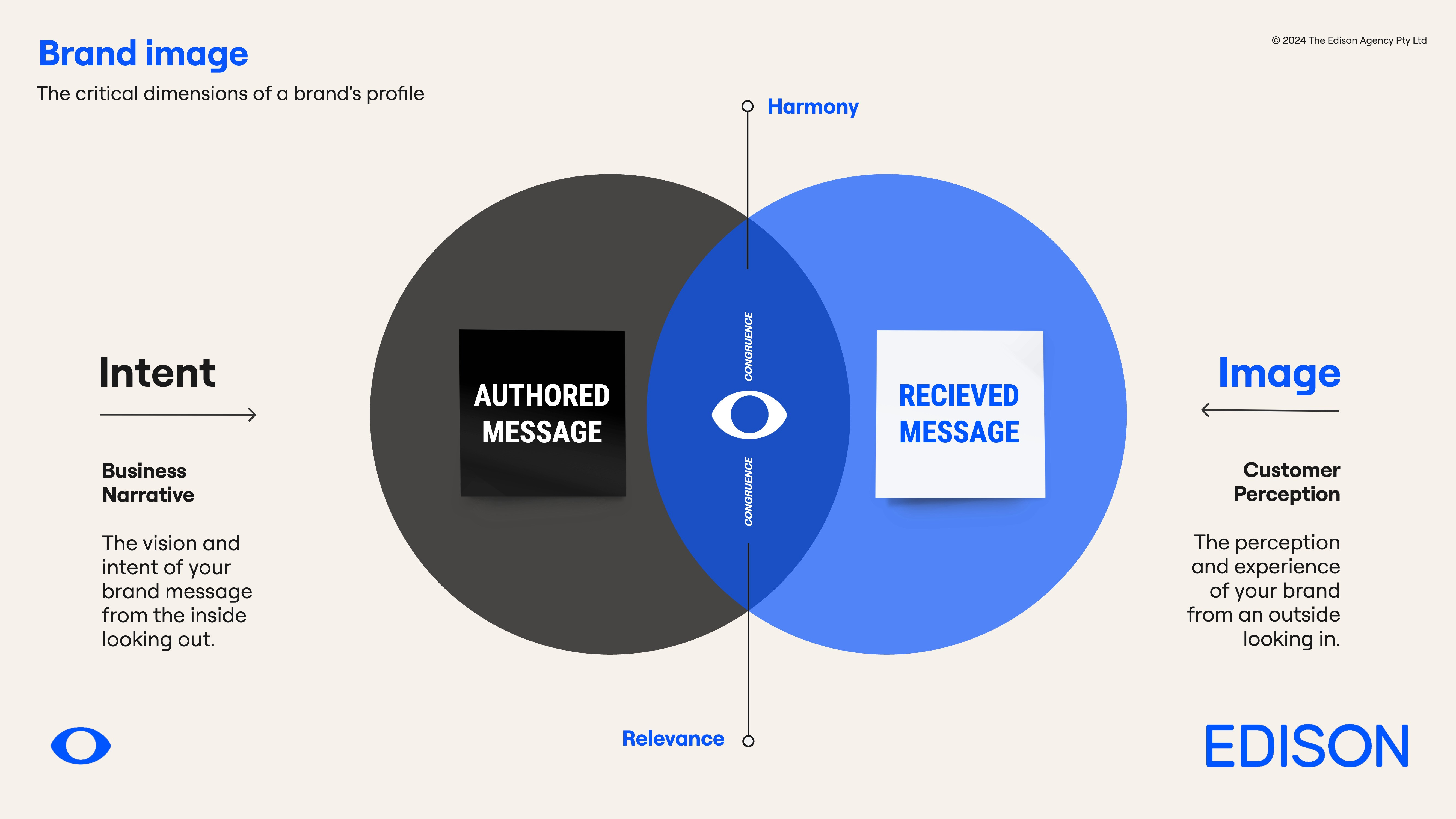
A company branded a product in the same way a cow was branded, a statement of provenance, heritage and status. Fast forward to today, brand owners don't really own their brands anymore - not really. While they are responsible for directing, nurturing and mentorship, it's now a two-way dialogue with an audience, and the sum of these over-lapping two worlds is the sweet spot of a great brand positioning that has resonance with its audience and is poised for positive change. Too far either side of the "authored intent" or "received image" and it's easy to see how the relationship between brand and customer loses its equilibrium and can lead to disconnect. Here's a simple way I use to look at this in my own work.
Good design sets the stage for behaviour to follow. Great design influences our experiences. Transformational design has lasting impact that will be remembered for generations- setting the wheels in motion for the betterment of many.
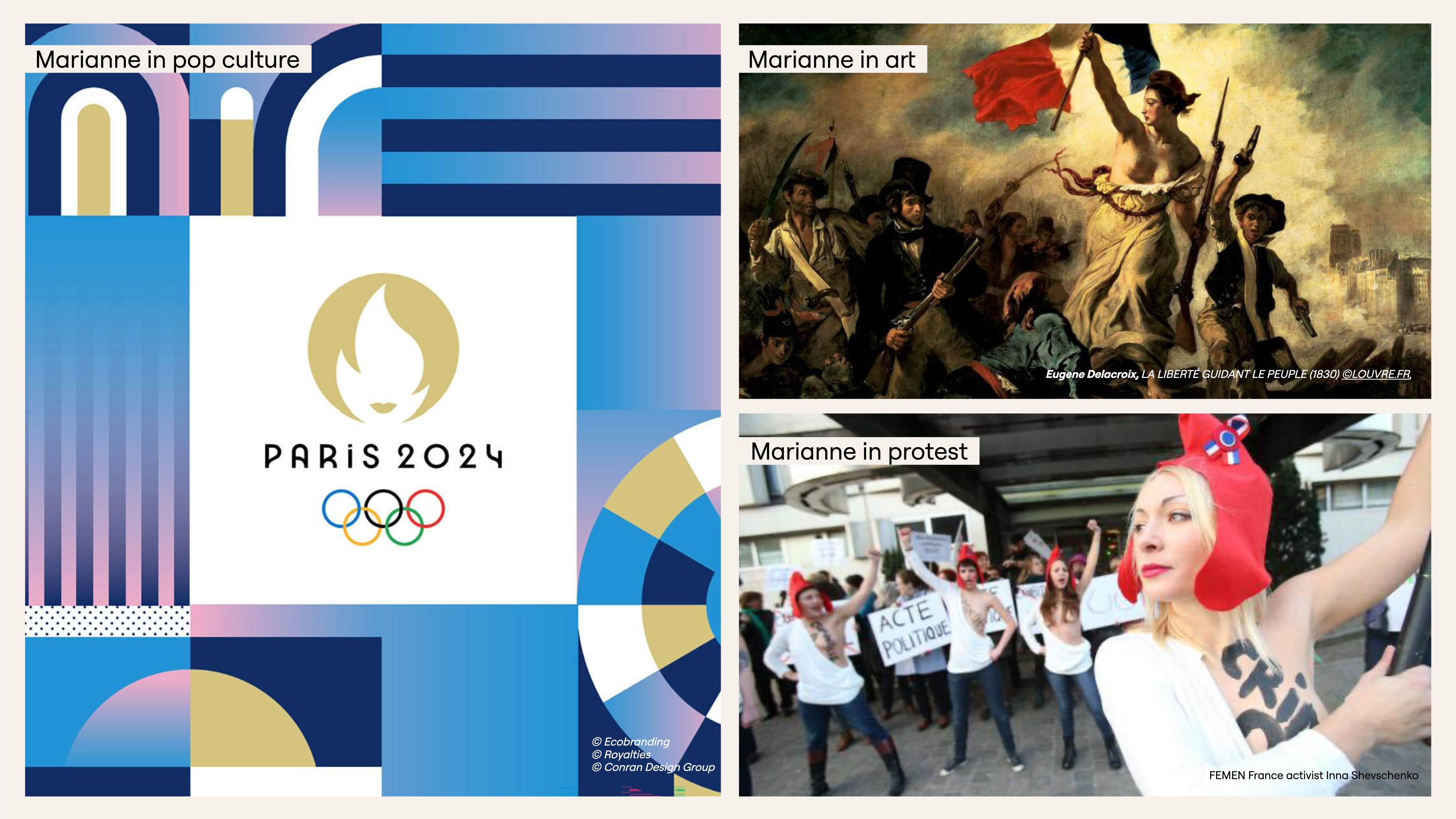
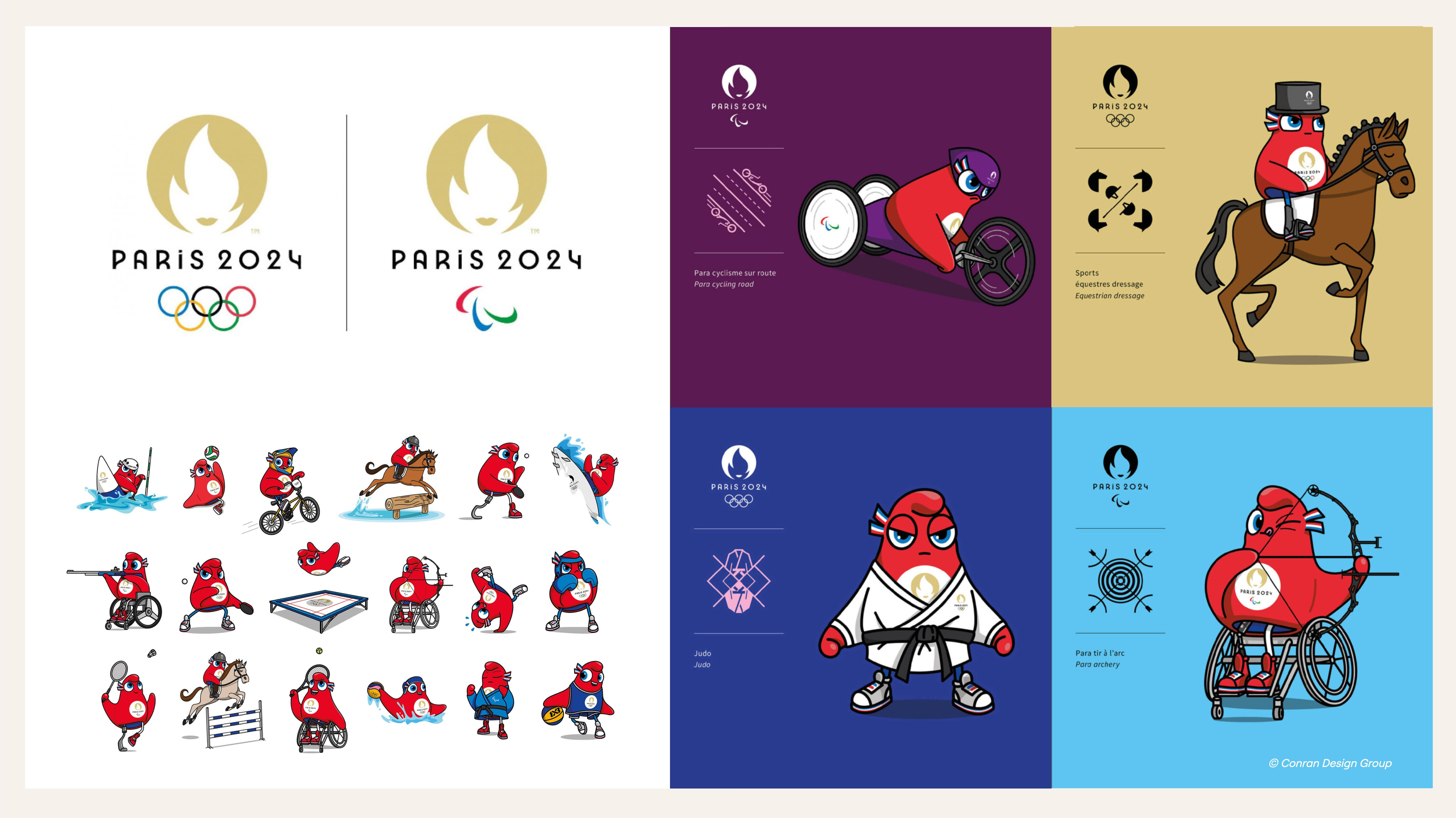
It’s no accident then, that the 2024 Paris brandmark (logo) is a symbol of a female face, an embodiment of Marianne who is an allegorical figure - a fictional symbol most famously brought to life in the iconic New York Statue of Liberty landmark. Portrayed as a goddess in the 1830 painting "Liberty Leading the People" by Eugene Delacroix's, she has since been re-expressed in sculpture, film, fashion, postage stamps and now as an inspired symbol of the 2024 Paris Olympics, integrated with the Olympic flame. This abstract homage was designed through a national competition in 2018 won by independent French branding agency, Royalties - the inventors of the sustainable corporate design methodology Ecobranding™. The Paris Olympic and Paralympic Games both share the same emblem, reflecting the Olympic brand vision to revolutionise the Games with greater equity and inclusion.
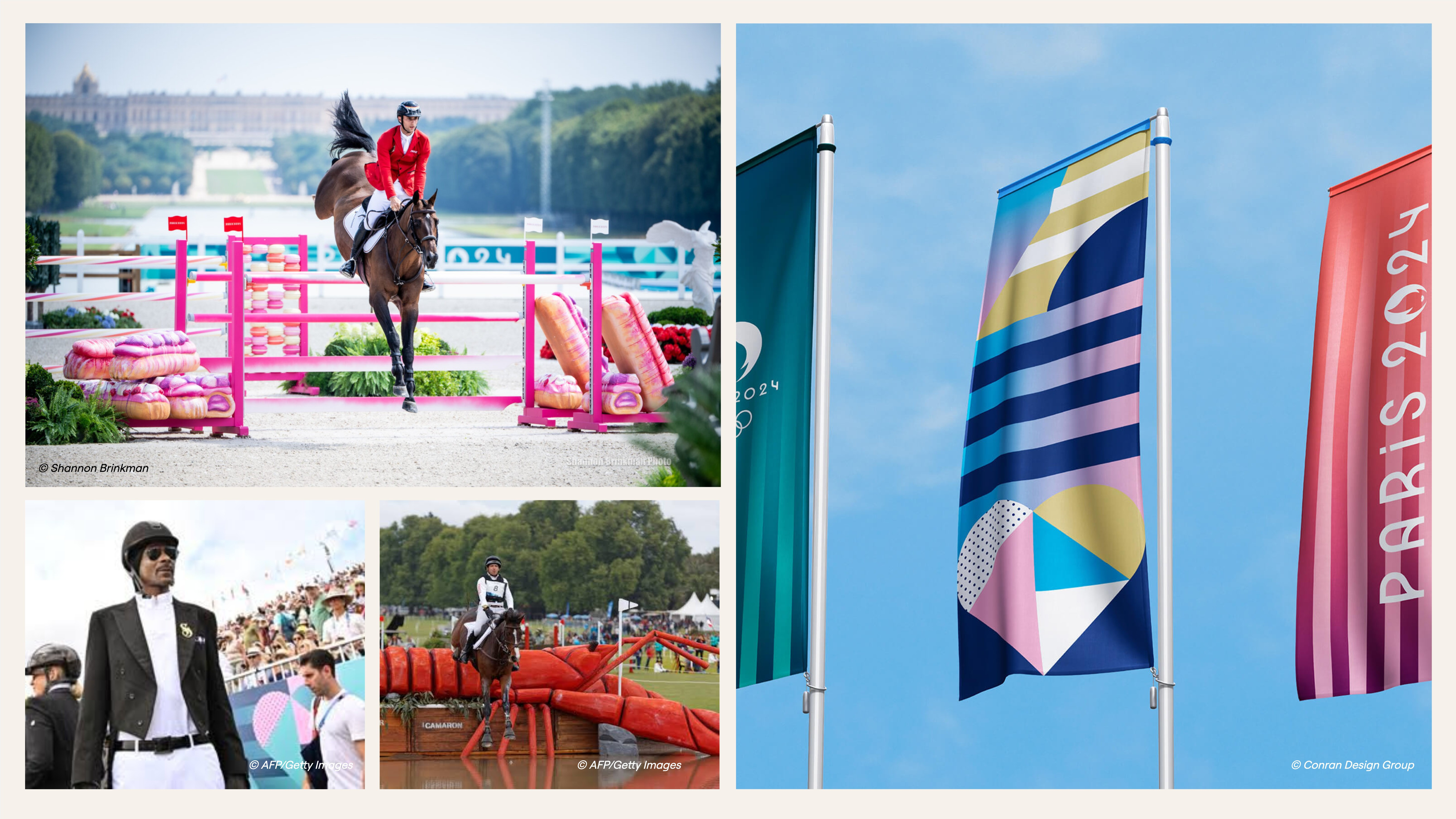
In harmony with a symbol anchored in inter-generational female empowerment, the new brand language-system brought Paris to life with fluid aesthetic joyful design. Created by global brand agency Conran Design Group, the component-based brand system bought equal measure gentle sophistication with playful unexpected charm. What I noticed with this design system was an absence of traditional masculine sporting codes - sharp angled lines, bright primary colours, typography that looks like it’s in a hurry to get somewhere. The aesthetic dominated by gentle pinks and blues with heart shaped mosaics inspired by French design heritage (the Art Deco movement) with a new language that celebrated high performance sporting prowess without the biased sporting cliches.
There’s a confidence in the quietness and silliness - an inclusive, anti-stuffiness that certainly elevated the spirits of those of us watching from the comfort of our lounges. One of the most spectacular expressions of this playful French frivolity were the Equestrian Show Jumping and Dressage event designs. Mimicking extroverted theatre sets, these included lobster-shaped jumping obstacles, akin to Ballina’s Big Prawn or Sunny Coast's Big Pineapple, and pink custard filled pasties hugging the jumps. It was a fantastic display of cultural creativity that was surprisingly playful in context to the rigid and elitist norms of equestrian sporting codes.
Then there is the gender-neutral mascots inspired by the Phrygian cap, a symbol of freedom and unity. Their motto – ‘Alone we go faster, but together we go further’ – echoes and underlines the collaborative nature of the Games and the strategic importance for the French 2024 team to be united as one team -bringing together the Olympians and Paralympians in equal parity.
“We wanted to say that everyone can emancipate himself or herself, thanks to sports,” says Anaïs Guillemané Mootoosamy, Design and Strategy Director on the project. So the hat might appear in a karate gi, and other times in a racing chair. Notably, the Phryges weren’t designed to just be happy or enthusiastic. They are a bit mischievous, hinting at a certain desire to win at any cost while avoiding a more generic and biased personality.
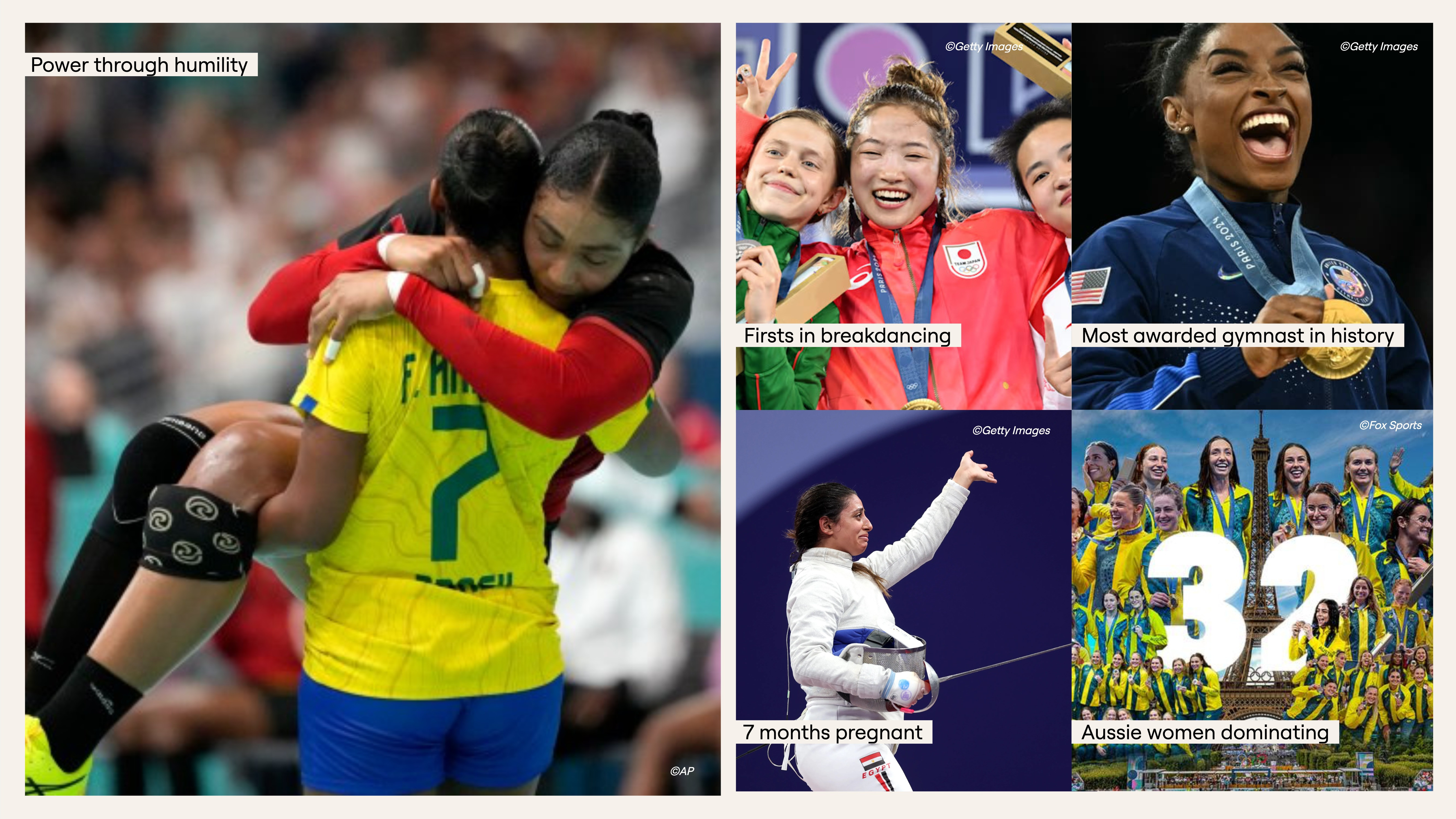
The 2024 Paris Olympics belonged to women and will no doubt shift the brands engagement through a more diverse audience lens. Women shone on the world stage, smashing records along the way - in the year after the new brand logo was revealed. The Paris Olympic Committee announced a total parity between male and female participants, with 50 percent of this year’s athletes being women — a historic first! The effects of the branding already having serendipitous impact.
Brazil’s Tamires Morena produced one of the most touching and transforming moments of the Olympics in Paris after she carried her opponent, injured Angolan Albertina Kassoma, off the court. A triumphant display of power and humility that showcased an alternative attitude to traditional sporting combative culture. Another example of how the symbols of Marianne in the Olympics logo is being personified in real moments.
Looking to the future, the LA28 Olympic and Paralympic Games design has been released and it’s harnessing all the same energy as Paris but with cooler LA vibes. The branding celebrates the LA community, inspired by a city where everyone is unique and everyone belongs. Designed to be a platform for creativity, self-expression and inclusion, the brandmark more a collection of voices, rather than a singular monument or landmark.
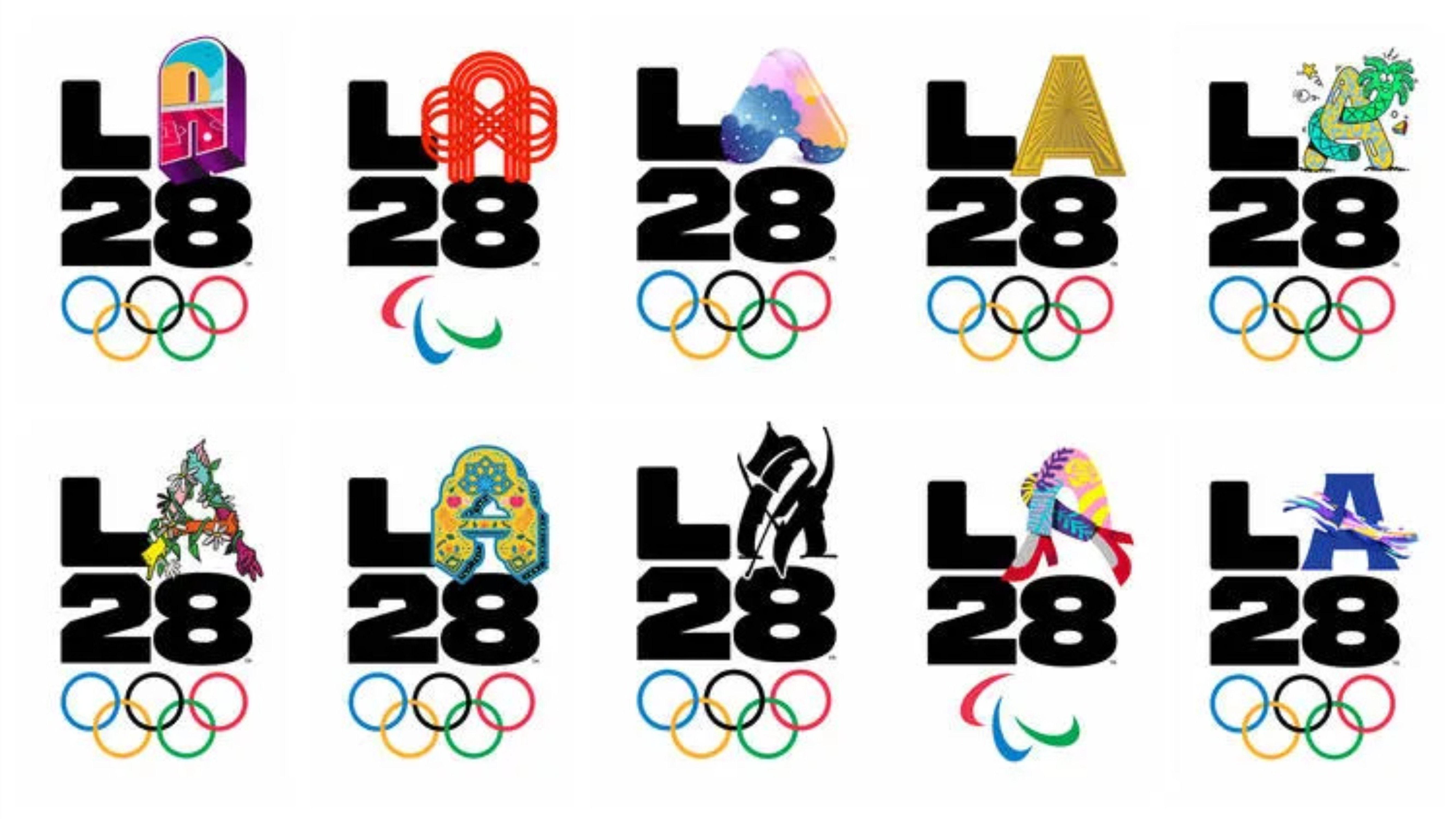
Los Angeles is an infinite canvas that represents millions of people and hundreds of languages,” said LA28 Chief Marketing Officer Amy Gleeson.“ No one mark could ever express all that Los Angeles and the Games represent. The best way to showcase the LA28 Games is by asking the community to share in the creation.” Some of the key collaborators on the branding project includes LA-based creative advertising agencies, video production studios, Nike Design Team, athletes and famous LA locals including musician Billie Eilish, actor Reese Witherspoon and YouTube star Lilly Singh. An impressive curation of talent that will no doubted be pushing the attitudinal boundaries of the Olympic brand image - for good.
I have dedicated over 25 years of my life as an adult to these two areas, working as a mentor, educator, writer, designer, podcaster, Chairperson and business leader. Every week I talk to clients about branding that adds value, that elevates an experience and aligns to a company’s vision.
Get in touch via The Edison Agency if you need strategic advisory on how your business can use design as a catalyst for change and rejuvenation.
Written by Amber Bonney (100% human content)