Toggle menu
Home
Us
Work
Impact
Media
Podcast
Say Hello
Toggle menu
Home
Us
Work
Impact
Media
Podcast
Say Hello
Home
Us
Work
Impact
Media
Podcast
Say Hello
All Articles
Community
Press
Awards
Insights
Insights
The good, the bad, and the downright ugly
Read more
Insights
The good, the bad, and the downright ugly
Read more
Awards
Next Steps Australia announced Winner at C2A Awards 2024
Read more
Insights
Breaking Boundaries; Creativity as the Ultimate Problem-Solving Tool
Read more
Insights
Breaking Boundaries; Creativity as the Ultimate Problem-Solving Tool
Read more
Press
People in Packaging feature: Amber Bonney – bold and brave
Read more
Awards
Two GOLD and a Highly Commended at Transform Awards ANZ 2024
Read more
Awards
Merit for Carbon Six at AGDA Awards 2024
Read more
Insights
How Vodka Cruiser’s 2011 Rebrand Changed the RTD Category
Read more
Insights
How Vodka Cruiser’s 2011 Rebrand Changed the RTD Category
Read more
Insights
A reflection on rebellion, resilience, and reinvention
Read more
Insights
A reflection on rebellion, resilience, and reinvention
Read more
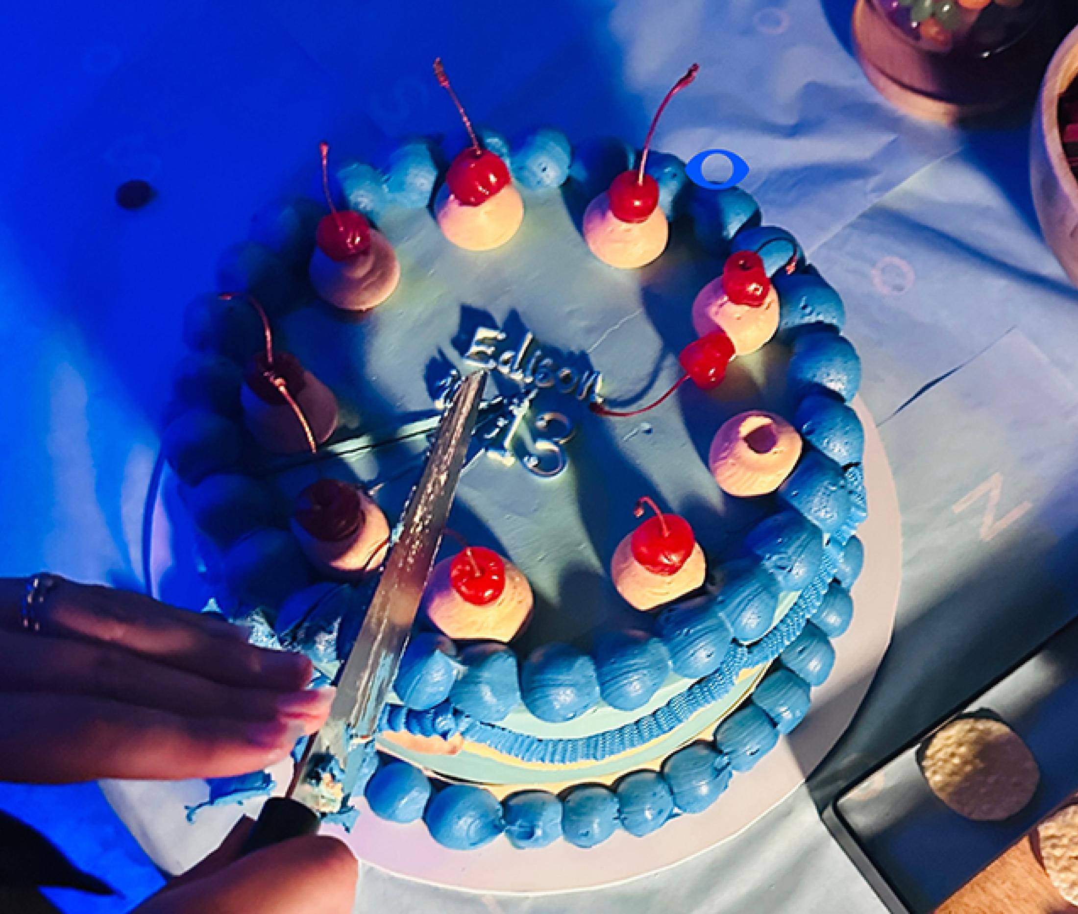
Awards
Edison are finalists at Transform Awards ANZ 2024
Read more
Awards
Pollinate - Gold at Sydney Design Awards 2024
Read more
Awards
Vuvale - Gold at Sydney Design Awards 2024
Read more
Insights
Impact Summary FY24
Read more
Insights
Impact Summary FY24
Read more
Insights
Why brands have the power to ignite, if you know how to light them.
Read more
Insights
Why brands have the power to ignite, if you know how to light them.
Read more
Awards
Carbon Six - Finalist in Best Awards 2024
Read more
Awards
Carbon Six - Gold in Melbourne Design Awards 2024
Read more
Awards
Next Steps Australia - Silver at Melbourne Design Awards 2024
Read more
Insights
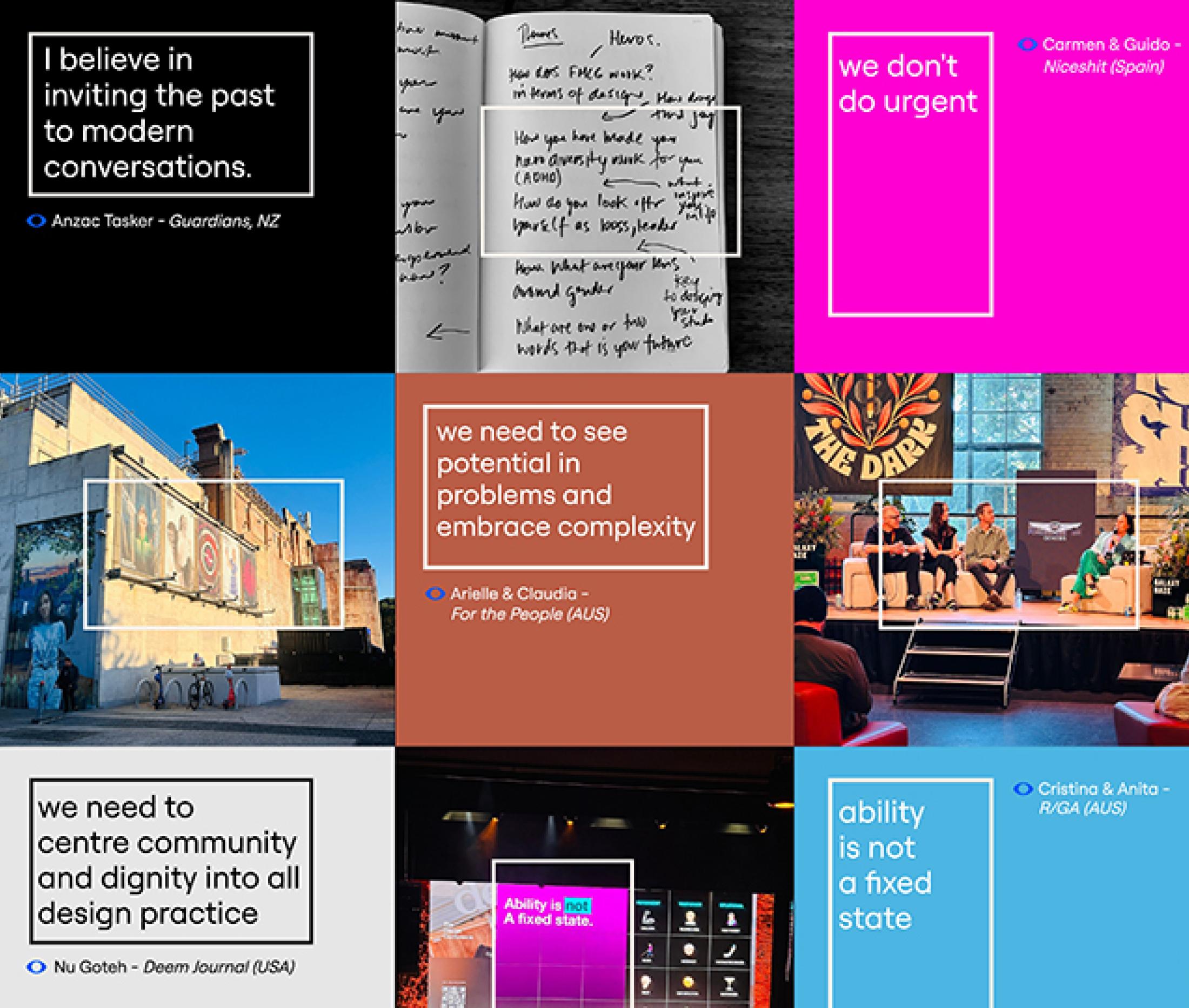
Musings from The Design Conference 2024
Read more
Insights
Musings from The Design Conference 2024
Read more
Awards
Bega Corporate wins Silver at WILD Design Awards 2024
Read more
Awards
Mr Chens wins Silver at WILD Design Awards 2024
Read more
Awards
Bass & Flinders shortlisted at WILD Design Awards 2024
Read more
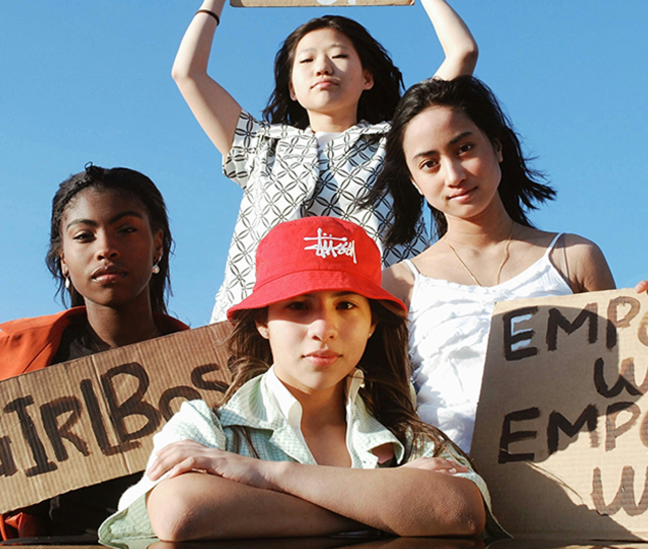
Insights
The rise and fall of the Girlboss
Read more
Insights
The rise and fall of the Girlboss
Read more
Awards
Amber Bonney - Finalist in PKN Women in Packaging Awards 2024
Read more
Insights
Why marketers can transcend consumer focus
Read more
Insights
Why marketers can transcend consumer focus
Read more
Community
Amber announced as 2024 Assisterhood Mentor
Read more
Insights
Principles of a brand Revolution
Read more
Insights
Principles of a brand Revolution
Read more
Community
Sustainability and branding on the ecoporium stand
Read more
Insights
Women we love...
Read more
Insights
Women we love...
Read more
Insights
Why Taylor Swift is the ultimate brand master.
Read more
Insights
Why Taylor Swift is the ultimate brand master.
Read more
Press
Edison Agency hires four
Read more
Press
The Edison Agency team grows with four senior hires
Read more
Next
Go to page 1
1
Go to page 2
2
Go to page 3
3
Go to page 4
4
Go to page 5
5
Go to page 6
6
Go to next page (page 0)