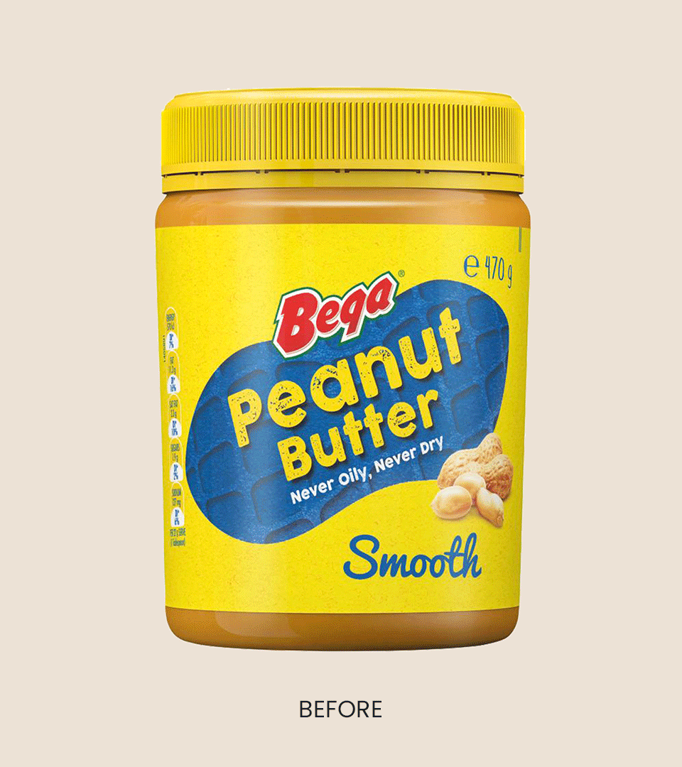
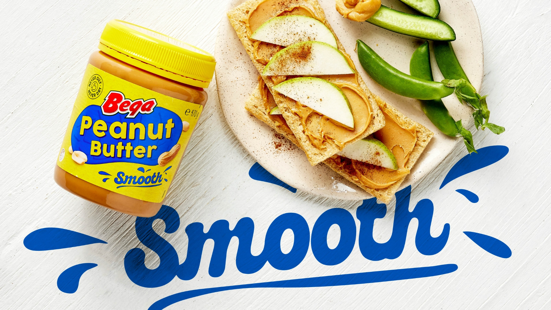
Peanut Butter is a pantry staple in over 80% of Australian households, and Bega Peanut Butter has long held the title of Australia’s favourite. But even icons need a refresh. Despite category dominance, the packaging lacked a modern navigation system that made it easy for shoppers to differentiate between varieties. The brand needed to reassert its leadership through a unified, bold identity that balanced heritage with everyday relevance.
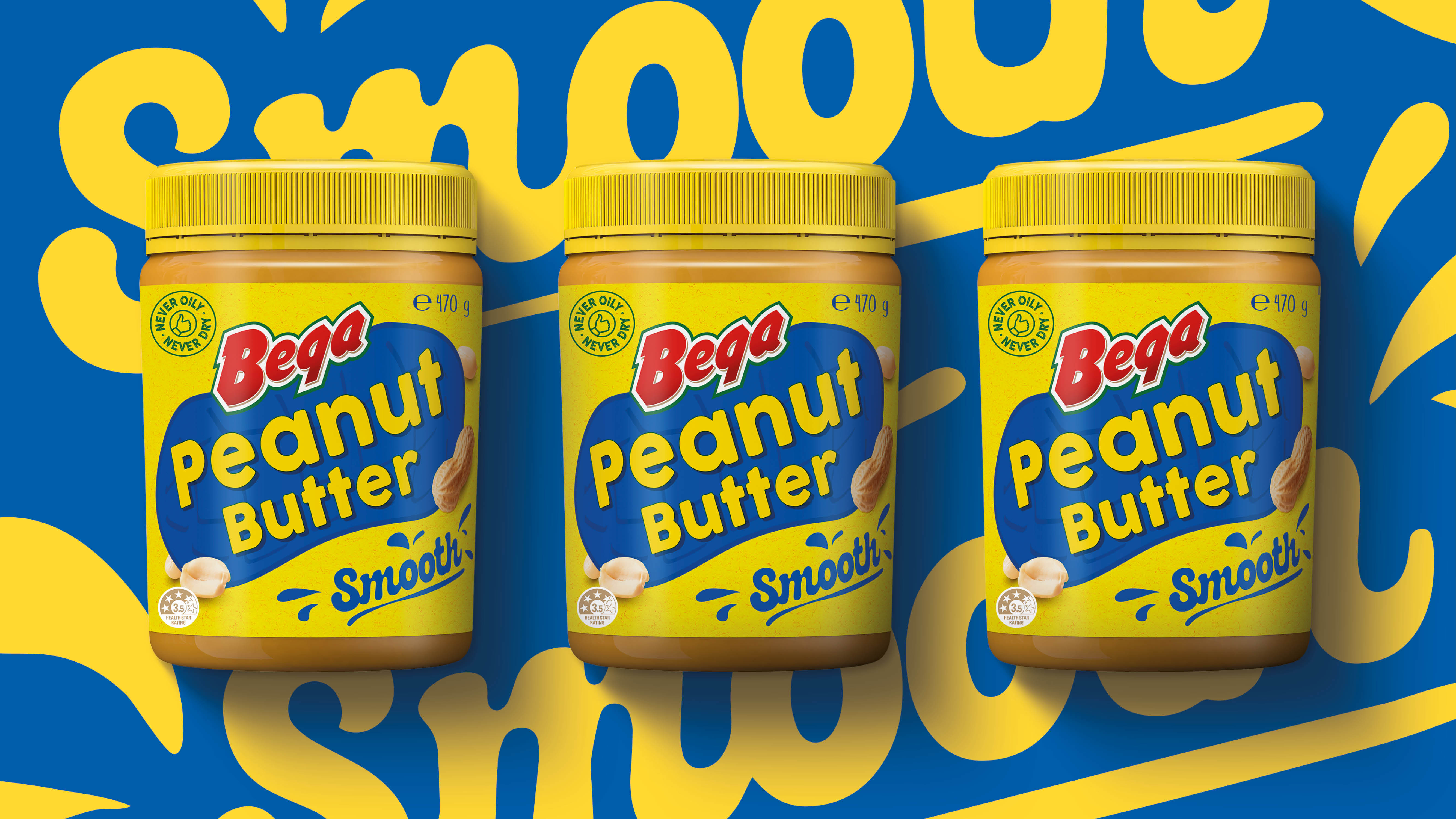
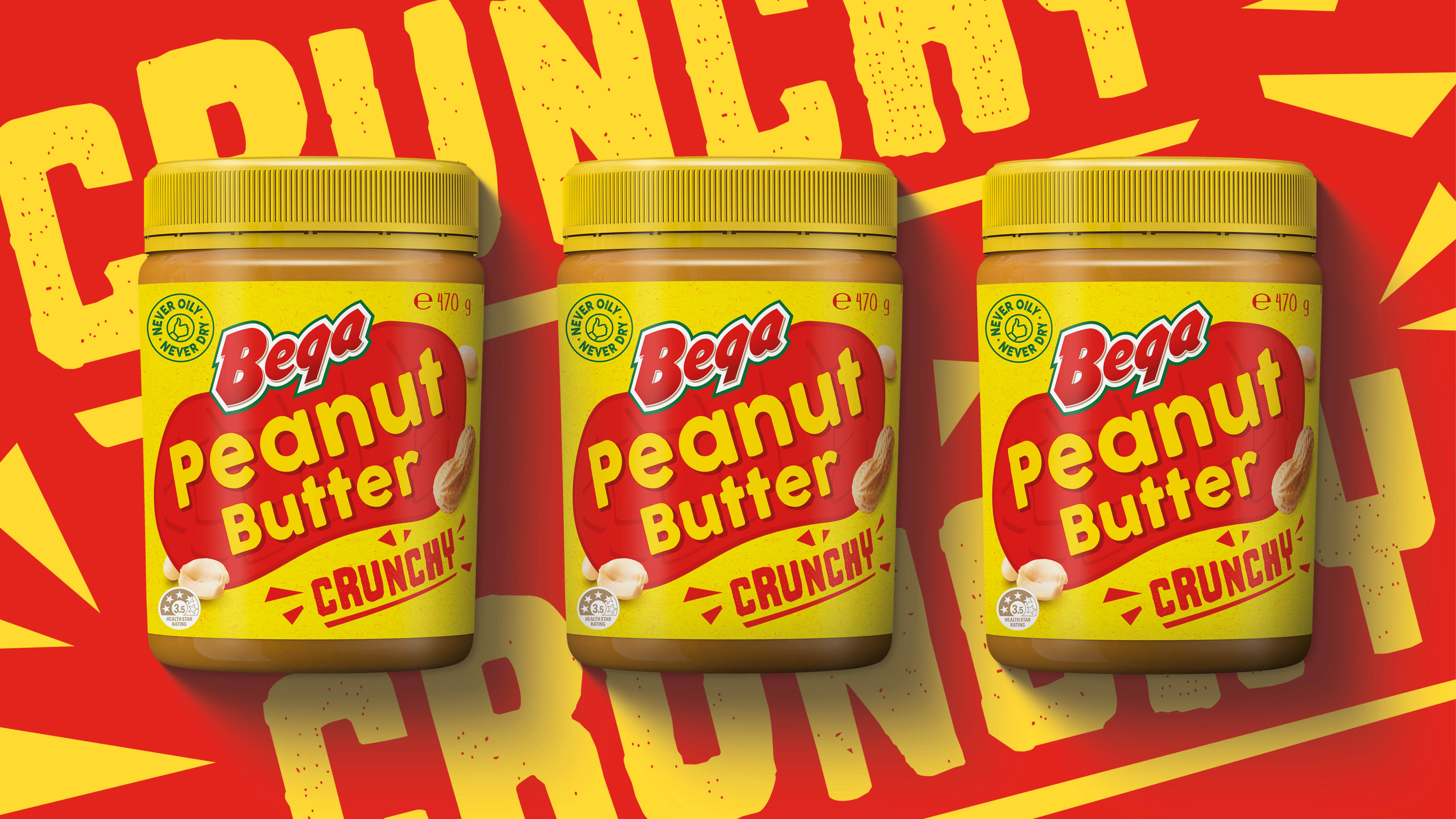
The Edison Agency delivered a refreshed packaging and architecture system designed to amplify brand presence and drive visual navigation. Using behavioural cues that support intuitive decision-making colour blocking, bold typography, and icon-led variant signposts the refreshed Bega range is easier to shop and clearer to decode. The redesigned core celebrates simplicity and everyday wholesomeness, with an added layer of modern expressiveness presenting Bega Peanut Butter as the dominant leader they are.
The result is a more cohesive masterbrand expression, reducing friction in the aisle and reinforcing Bega’s role as the trusted peanut butter of choice for Aussie families.