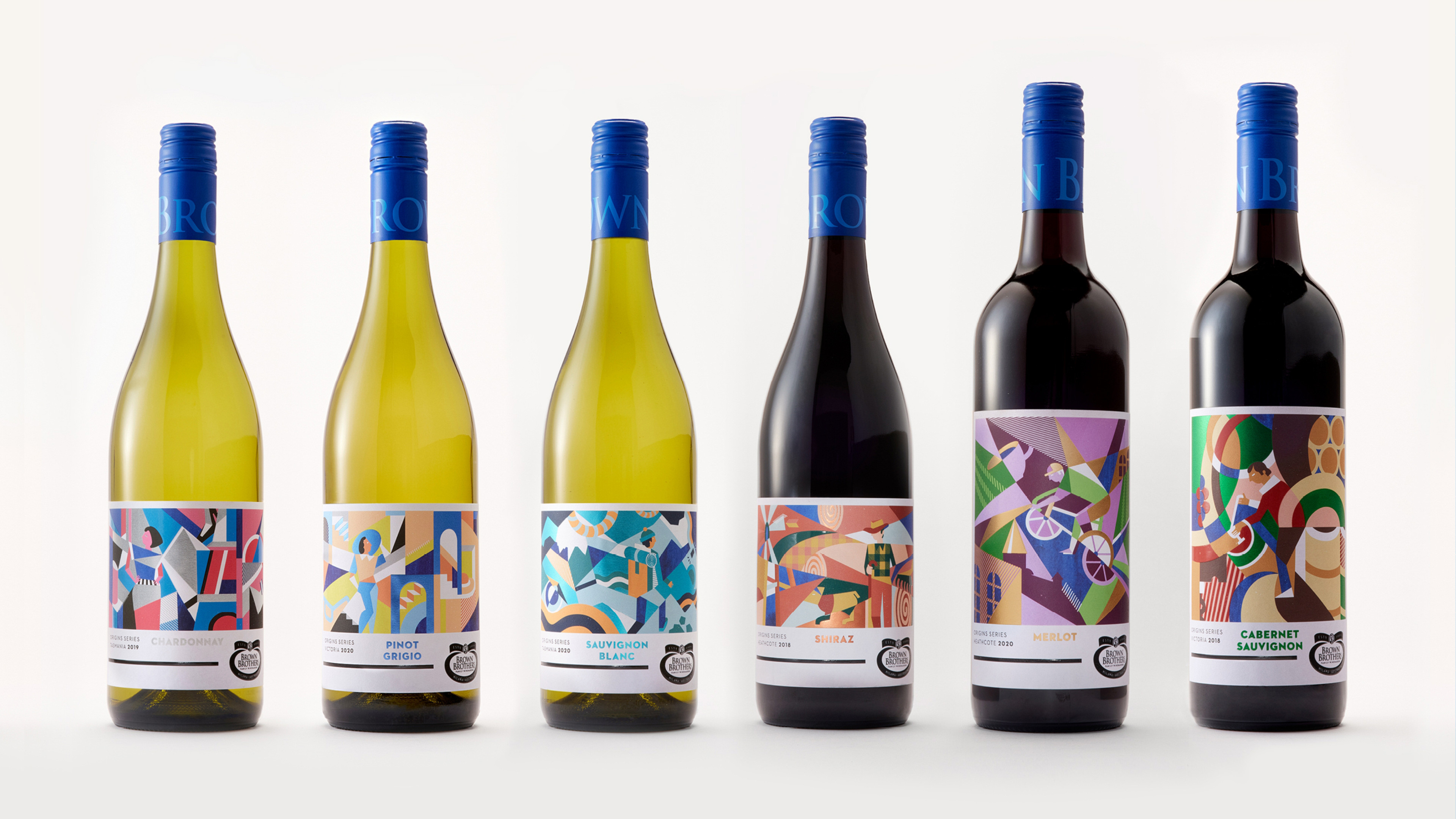
Brown Brothers were looking to update their primary retail range design to broaden their audience in core traditional varietals. The series platform ‘Origins’ was established, appealing to a sense of escapism, and celebrating the beginnings of wine varietals by bringing to life their story and sense of place.
Despite this new range belonging to one of Australia’s oldest and most awarded family of winemakers, the result needed to reflect a unique, modern and playful design that was inspired by the past but very much a celebration of today’s wine drinkers and makers.
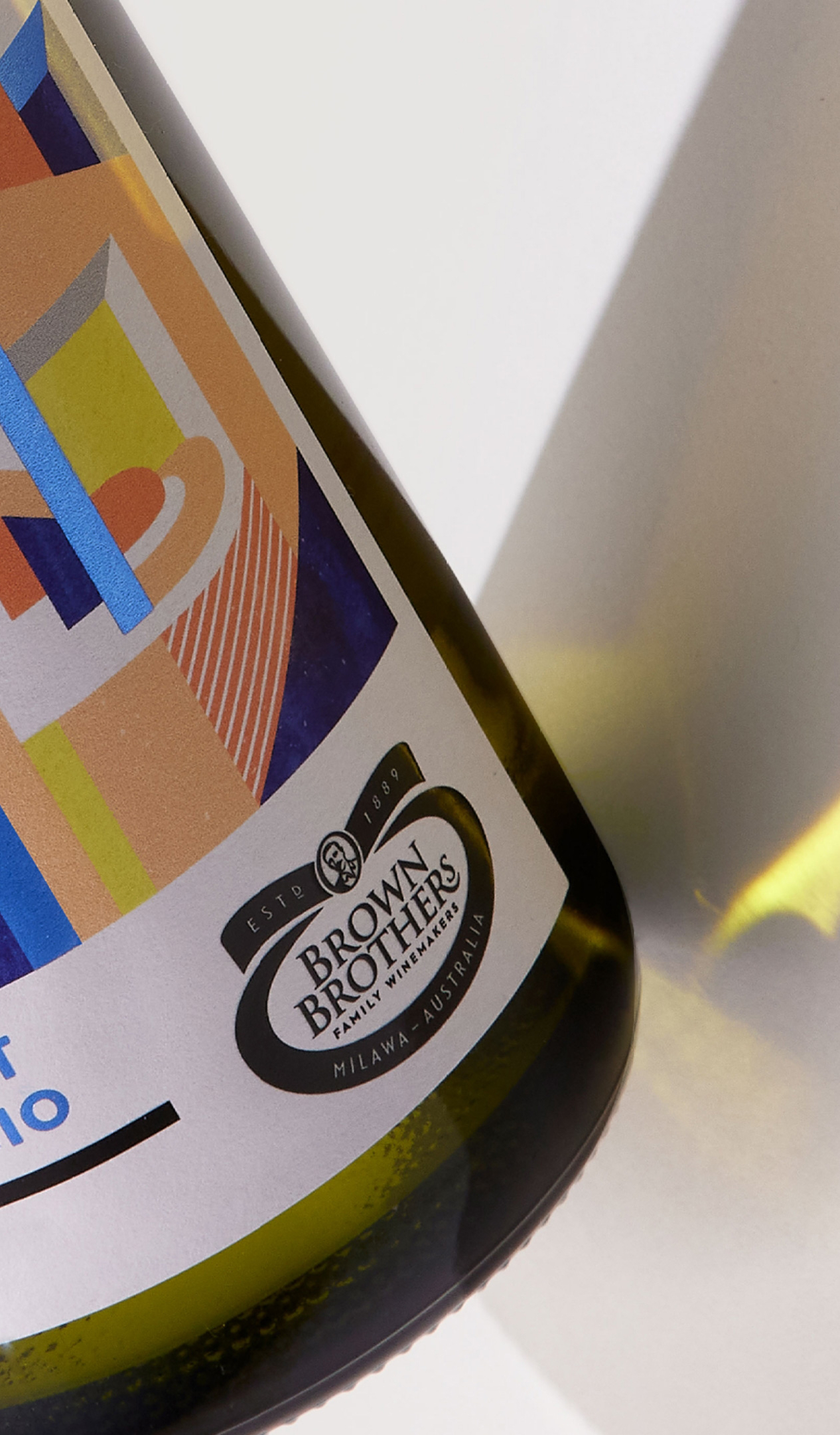
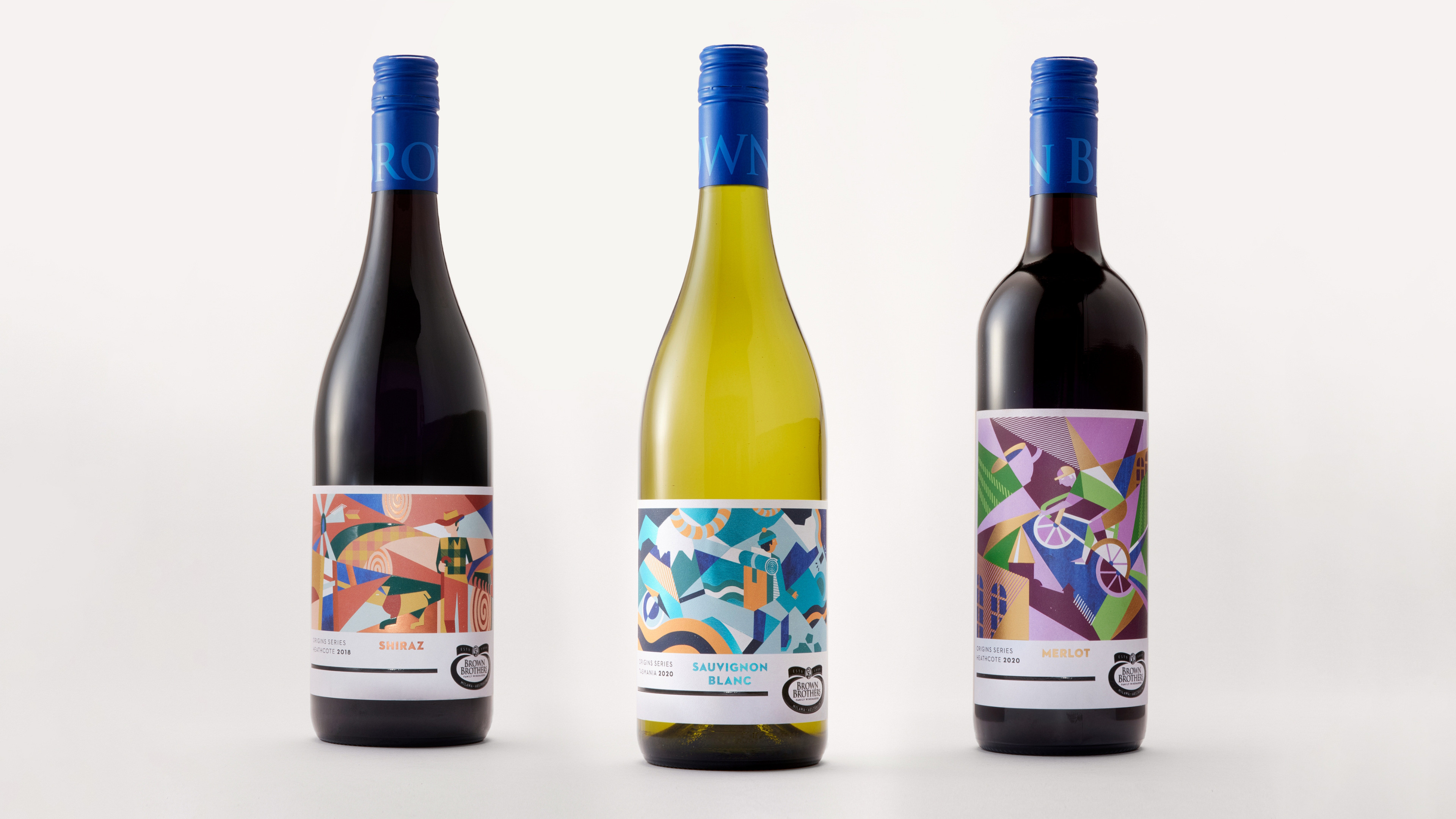
Drawing inspiration from both local and international wine provinces, this series is an artistic celebration of wine diversity for a youthful wine ‘explorer’. The resulting identity embraces the essence of both taste and location of each wine with Bauhaus-inspired illustrations and multi-sensory print embellishments and material selections.
Culminating in a design solution that is all about place and the wine each region makes. Taking the cues of factual abstraction style, this whimsical suite of labels explores a region, its colours, the people, and the spirit of the wine.


