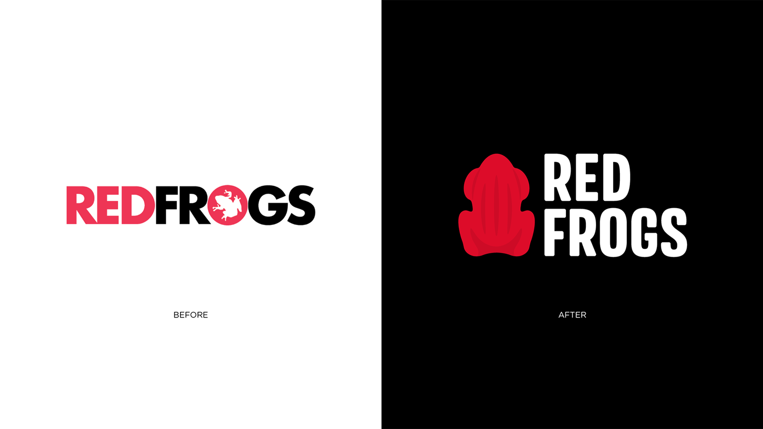
Since 1997, Red Frogs has grown from a small Schoolies initiative into Australia's largest youth harm-reduction service, supporting over one million young people annually. Rapid expansion across schools, universities, festivals, and community programs had produced a fractured, inconsistent visual identity, leaving volunteers unrecognisable in high-pressure environments and undermining credibility with sponsors and institutional partners.
The Edison Agency repositioned the iconic Allen's red frog lolly from nostalgic mascot to functional design device, anchoring an entire identity system around its form. Discovery workshops with Red Frogs staff, volunteers, and Founder Andy Gourley surfaced a key insight: the lolly wasn't just a brand asset, it was the founding act of care. A vibrant colour palette, bold typography, and modular layouts create a visual language that is both youthful and credible. Built for deployment via Canva and Miro, the system empowers volunteers and regional teams to produce communications independently.
The result is a design system that doesn't just look like Red Frogs, it behaves like Red Frogs: adaptable, human, and built for impact at scale.


