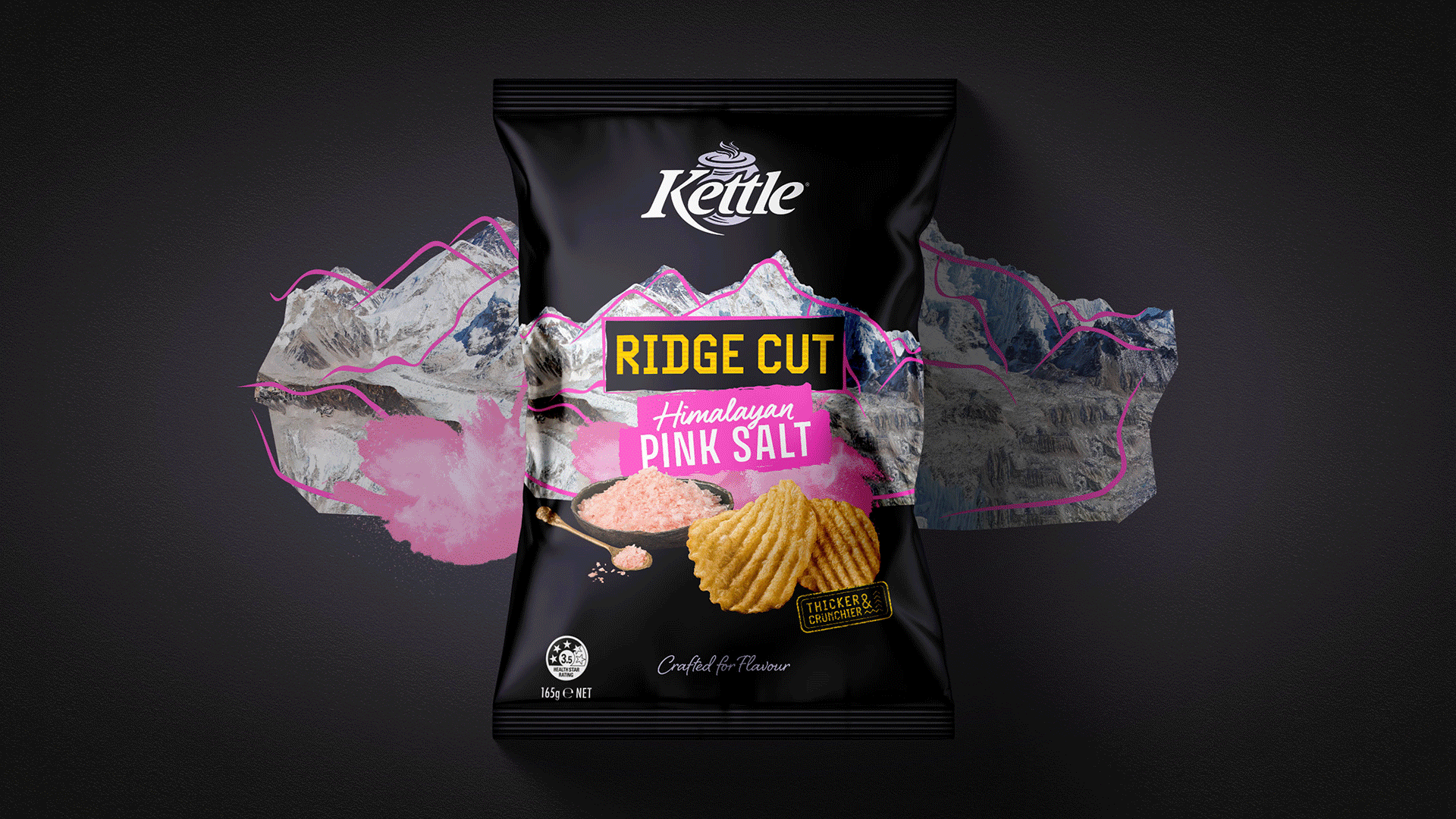
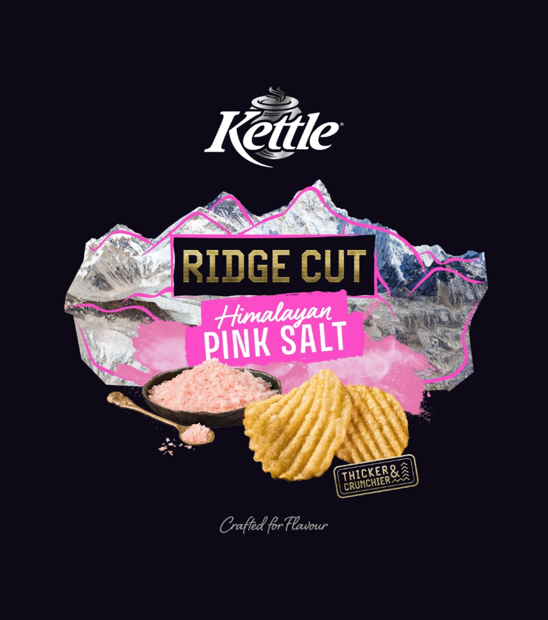
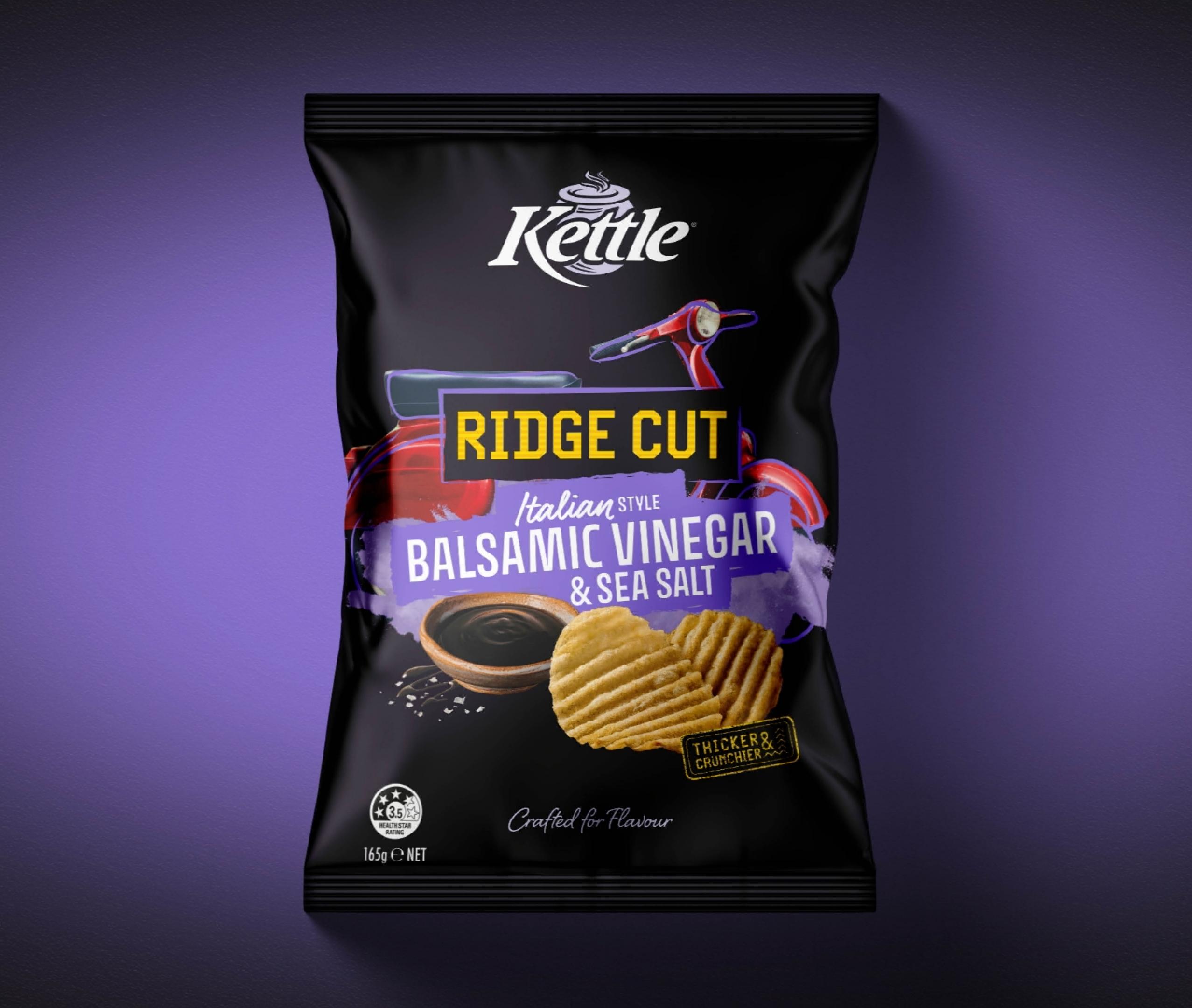
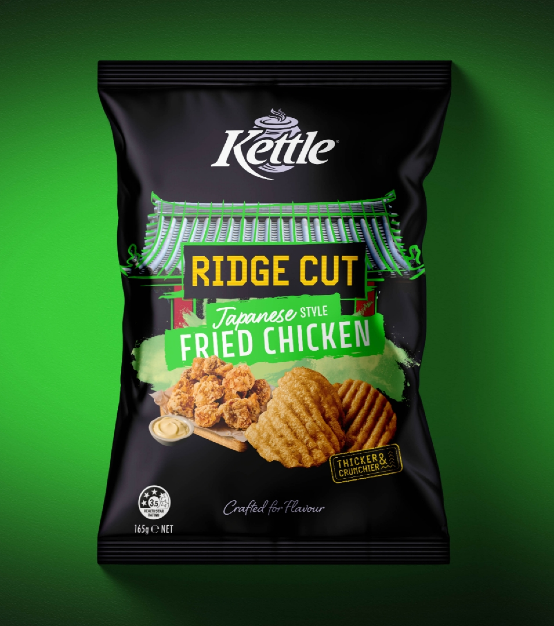
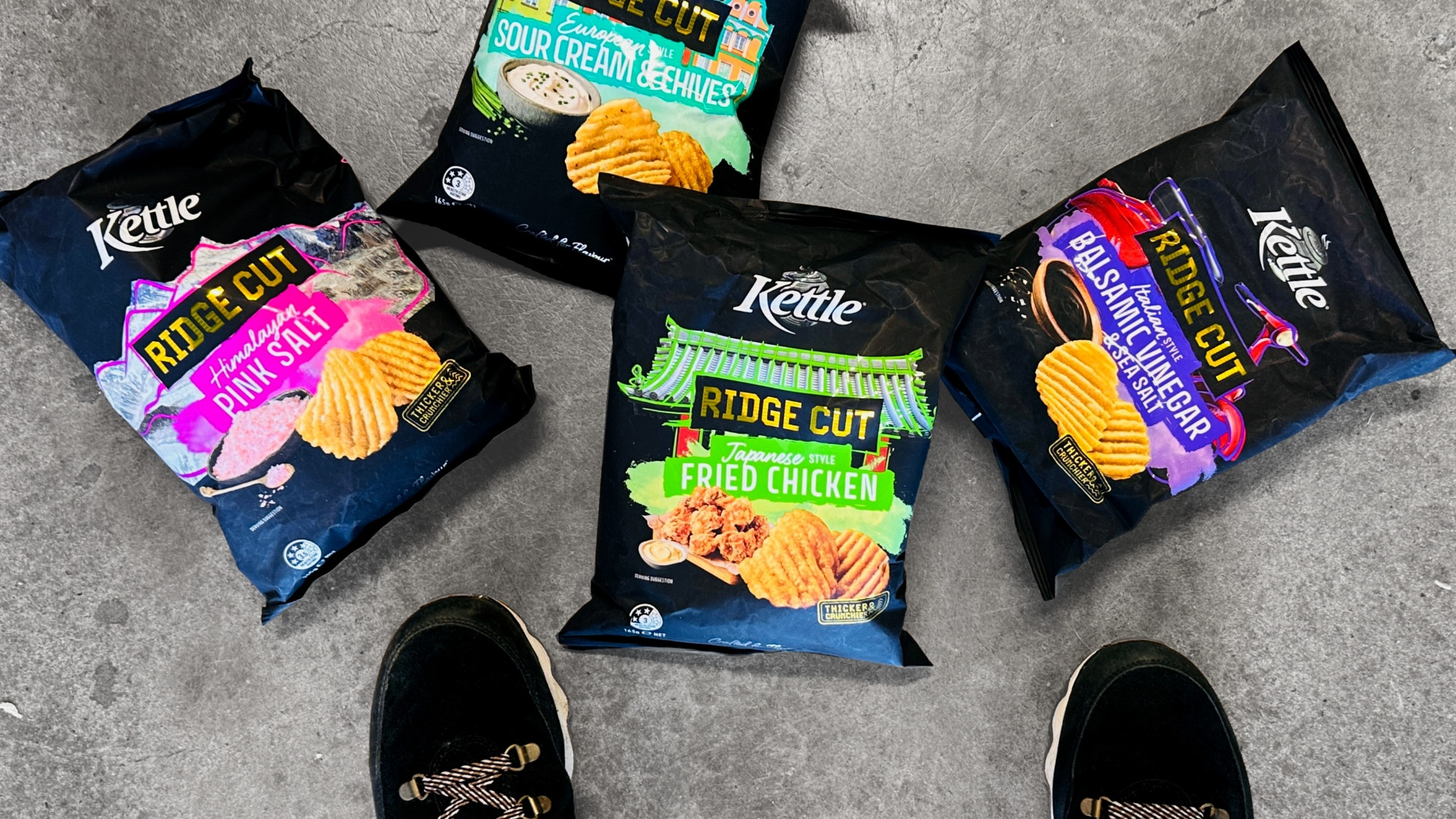
Kettle® set out to shake up the crinkle chip aisle with Ridge Cut, designed to bring bigger crunch, bolder flavour, and real craft back into the category. The goal? Attract a younger, flavour-hunting audience and give the segment a serious glow-up while staying true to Kettle®'s premium roots.
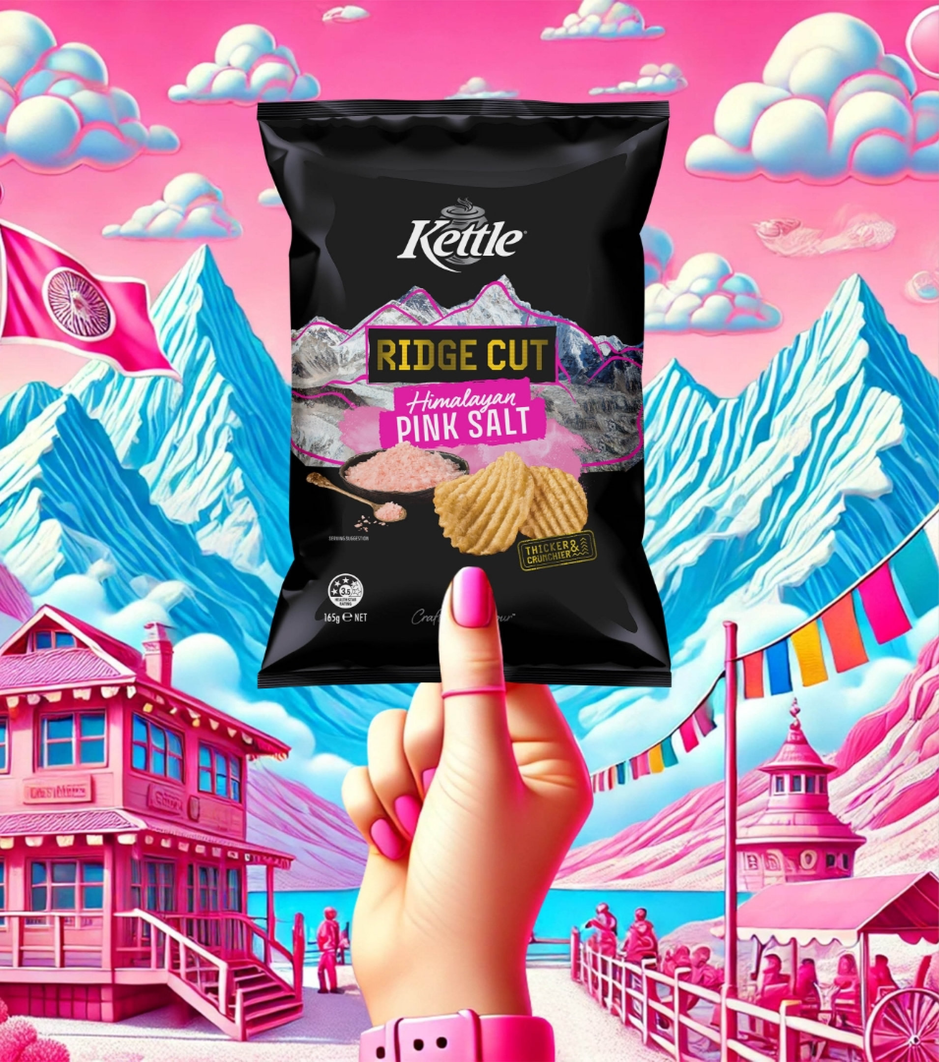
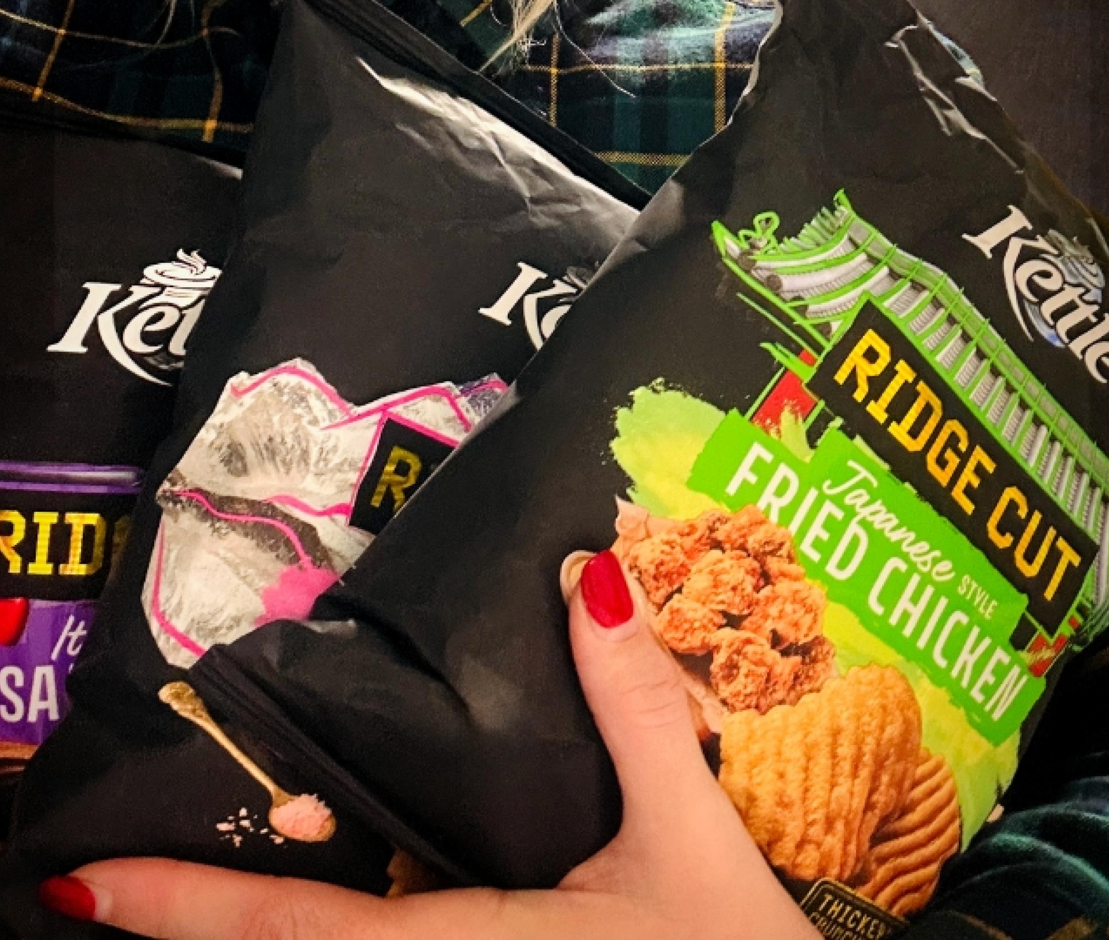
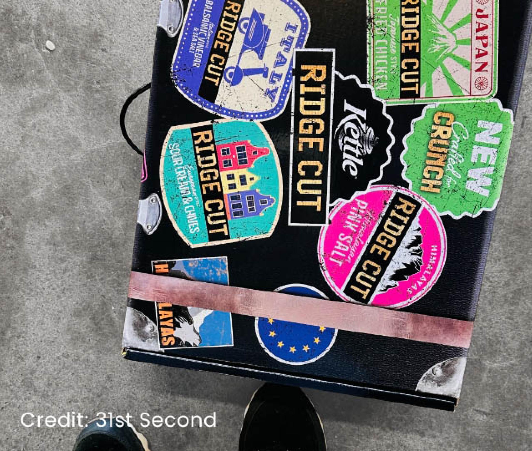
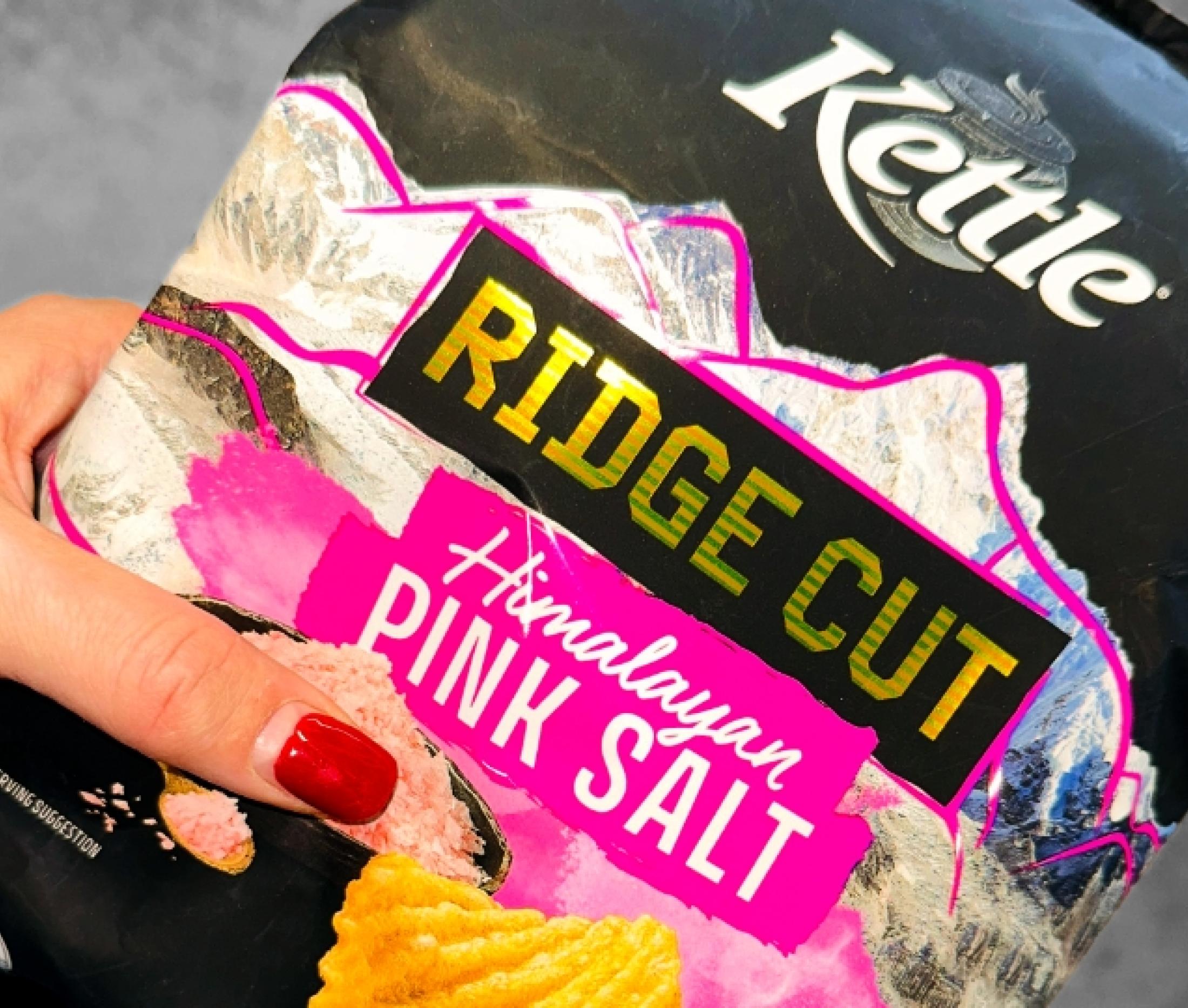
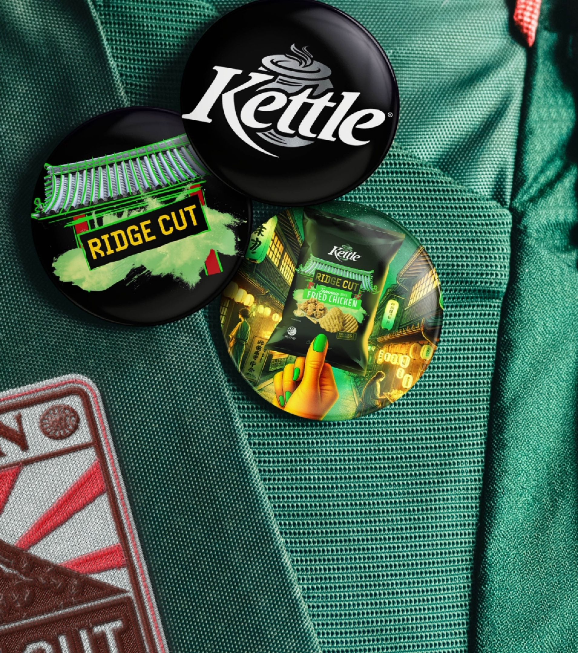
We took cues from the colour, energy and edge of global street food (think Japanese Fried Chicken and Himalayan Pink Salt) to build a sense of flavour adventure. Every detail, from pack design to typography, was carefully considered to break category conventions and create serious shelf presence.
The chip itself? A thicker ridged cut that holds up to big flavours and delivers a satisfying crunch, sensory and then some.
By blending bold innovation with street-savvy design, Kettle® Ridge Cut pushes the brand into fresh territory. It hits the mark for modern snackers and reminds the category what flavour-forward really looks like.