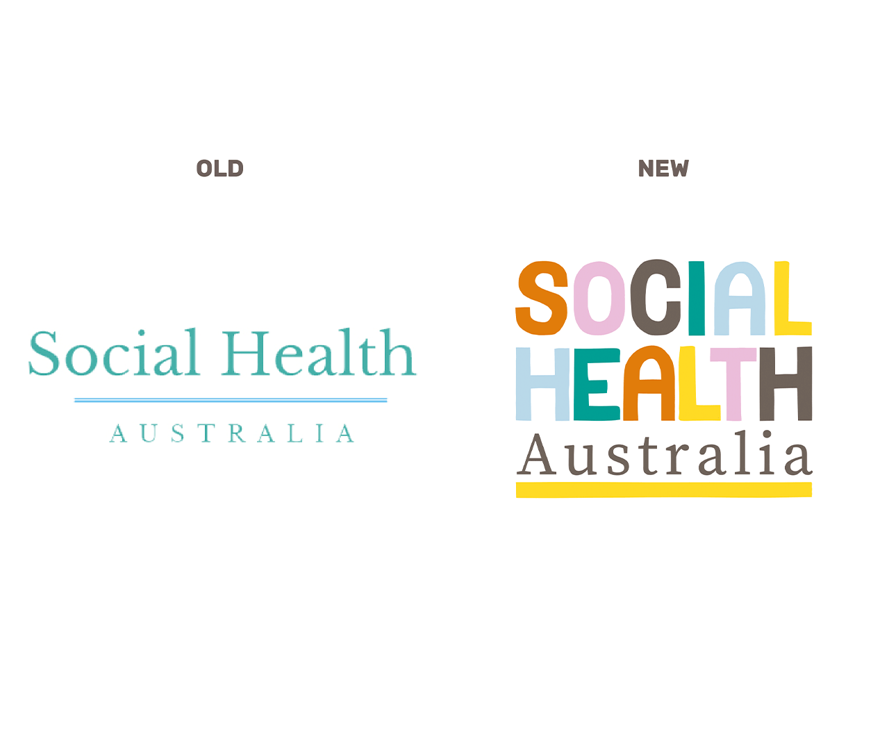
Social Health Australia (SHA) exists to redefine care, supporting people through loneliness, grief and life’s emotional edges. As a newly formed charity seeking DGR status and government funding, SHA needed more than a logo. They needed legitimacy, clarity and a brand that spoke to both their purpose and progressive outlook.
Edison led a strategic transformation, repositioning SHA with a distinct voice and visual identity that stood apart from the clinical conventions of traditional care. Inspired by human connection, the design system introduced handcrafted aesthetic and a warm, uplifting tone of voice. The identity offered a visual metaphor for care that’s inclusive, creative and emotionally intelligent.
With every element purpose-built, from the soft colour palette to the affirming language, this is a brand made by people who care, for people who care. A powerful reframe of what health can mean in modern Australia.


