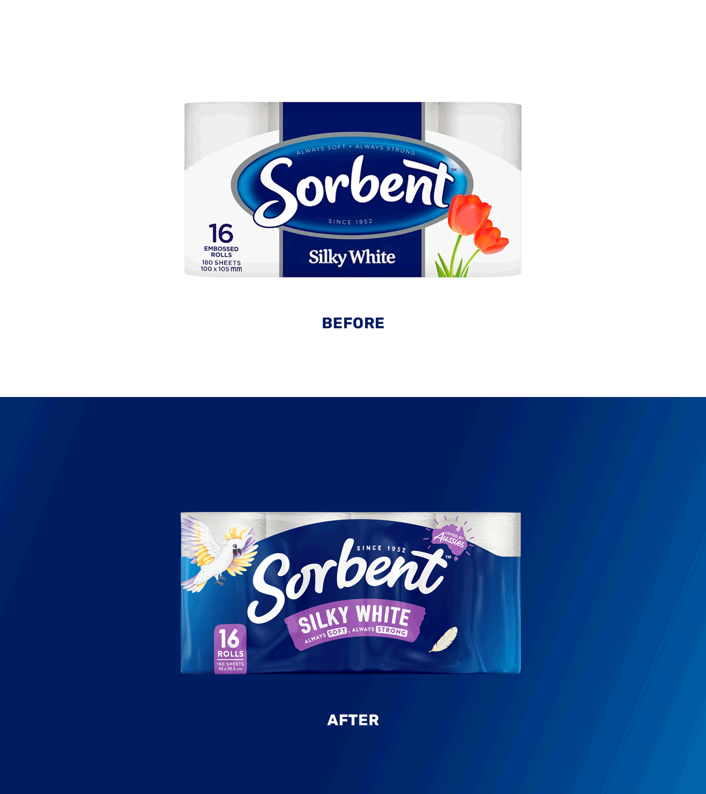
Sorbent is a trusted Australian brand that's helped us blow our noses and wipe our bums for over 70 years. With an undeniable great product, and entertaining comms in the past, the brand lacked distinction in both its visual language and what, if anything, it stood for.
With an undeniable connection to Australia, we saw the opportunity to convert this into an emotional resonance that distinguished Sorbent from its imported competitors. Representing the egalitarian nature of the bathroom and the activities that occur in there was the foundation to a new tone of voice that was distinctly 'Australian' and distinctly Sorbent. One that was inclusive, endearing and relatable.
The new brand system celebrates Sorbent's proud history in supporting Australians with the introduction of new character asset ‘Sunny' the Cockatoo, a modernised brandmark and revitalised colour system. A touch of larrikin and unashamedly honest, this tone shaped the visual identity and packaging design solution.
The final output provided Sorbent with a fresh and invigorated look and feel that in turn gave consumers a compelling new reason to purchase. It breathed a sense of youthful energy into the brand image whilst disrupting the currently stale category norms and creating a more active decision making process on shelf.


