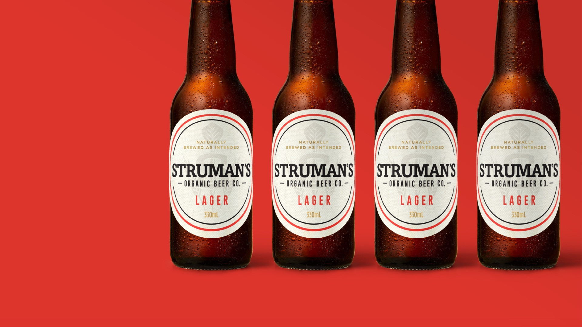
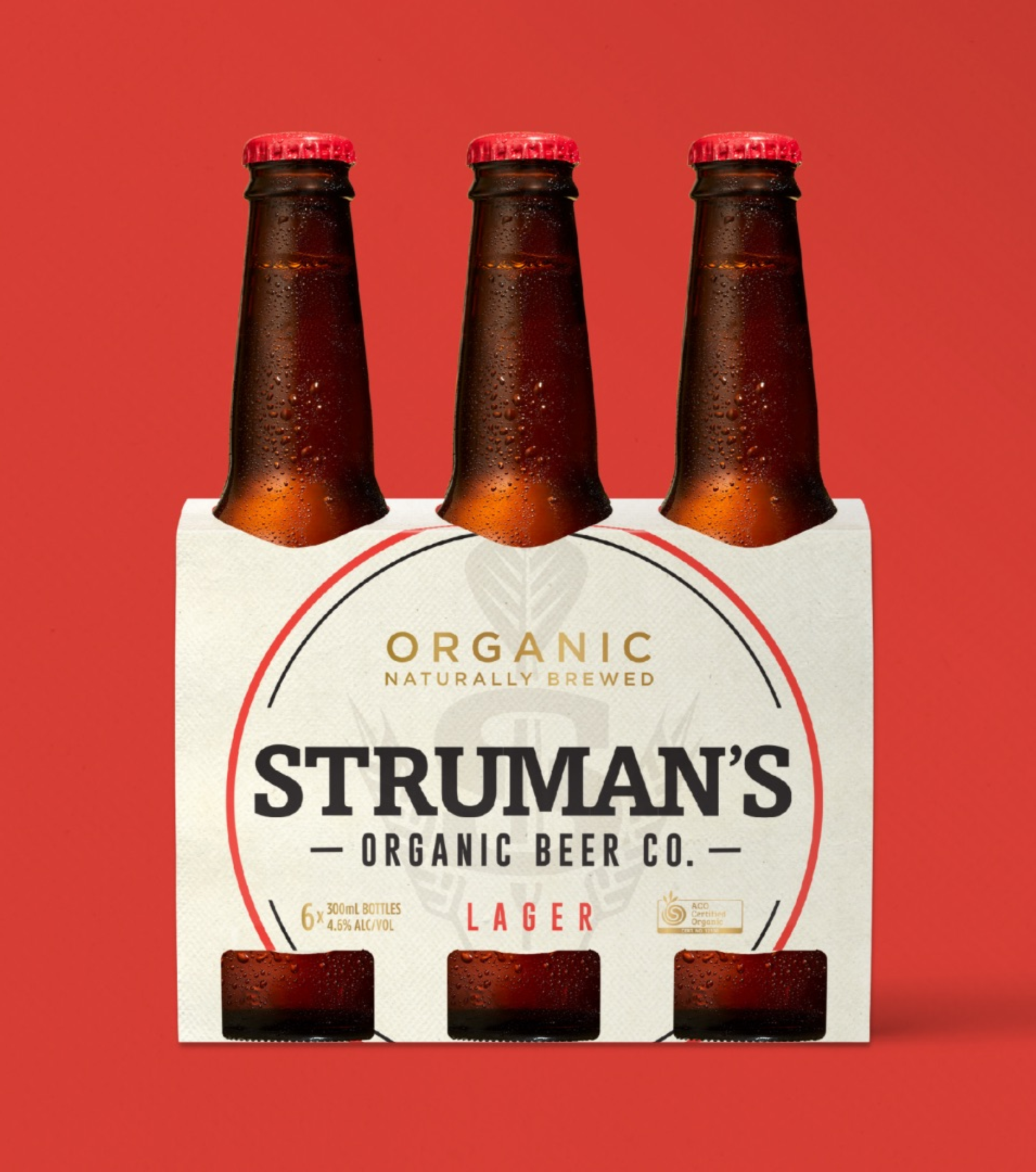
Struman’s launched as Australia’s only dedicated organic beer company – but within months, it became clear the brand needed to shift gears. Edison lead a strategic rejuvenation, moving Struman’s away from mainstream codes and into a more premium, ethically-driven positioning.
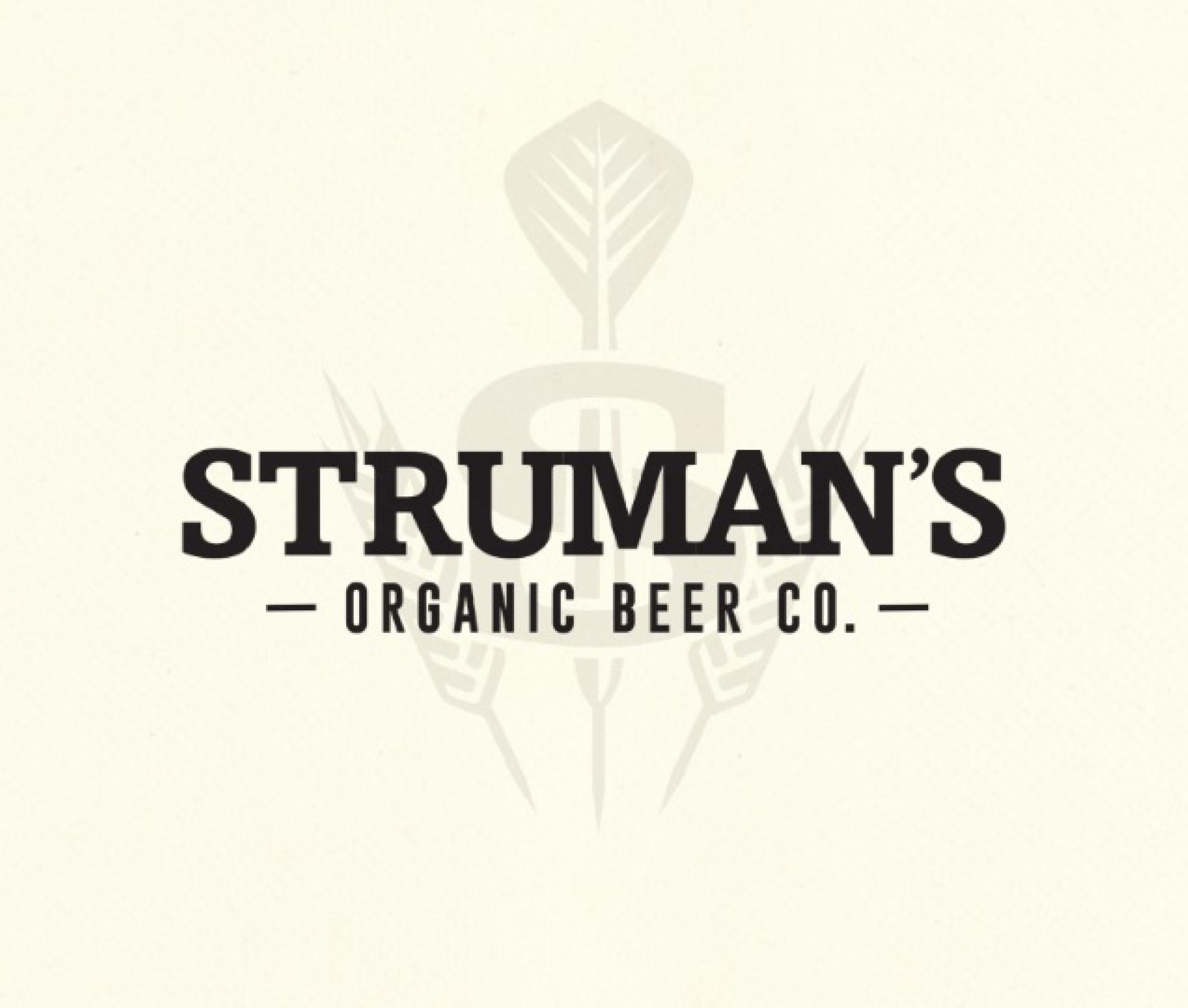
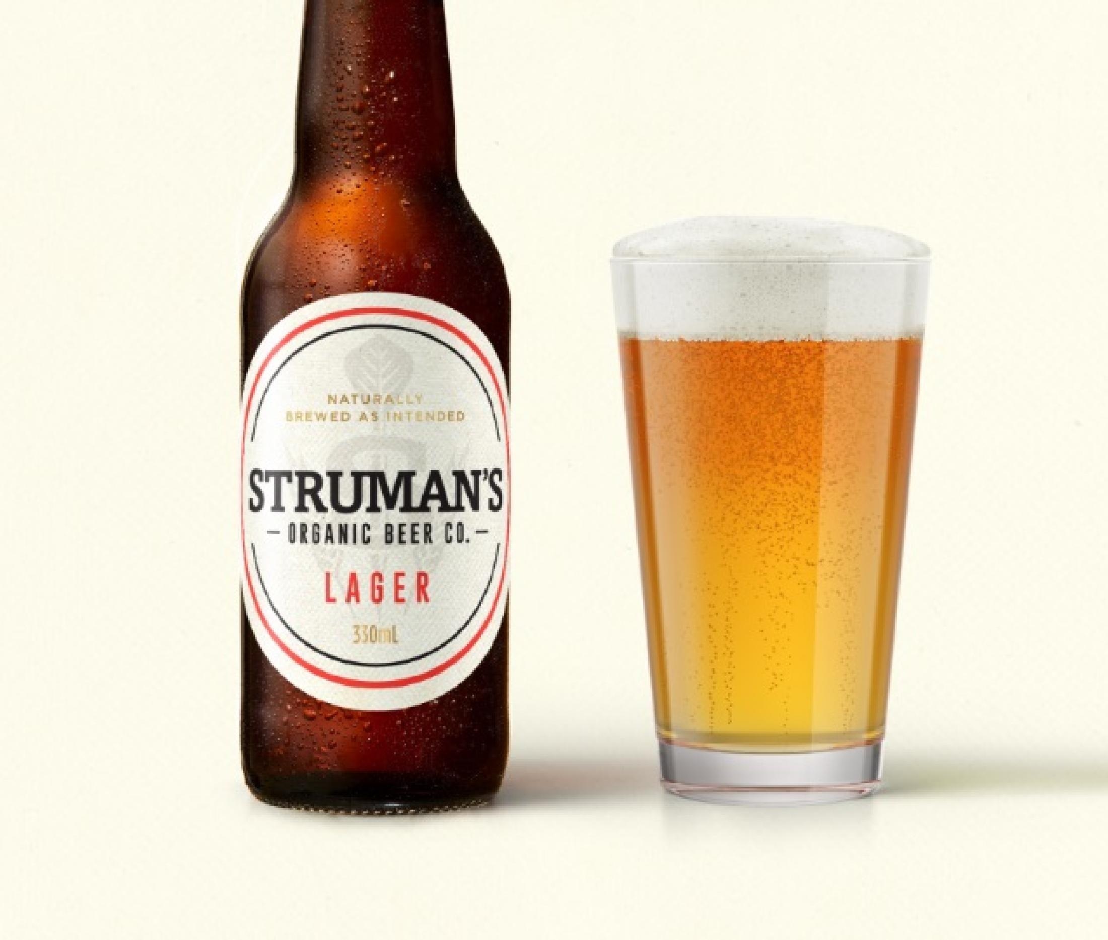
We reframed what premium meant for today’s drinkers, not flashy status cues, but integrity, provenance and understated quality. This insight shaped every element of the identity. Struman’s “S” mark with three darts, a symbol of the founders’ friendship, became a subtle signature of authenticity. A muted, warm-toned palette and tactile textures gave the brand a quiet confidence that resonated with conscious beer drinkers.
This wasn’t just a design refresh, it was a values-led repositioning that clarified the brand’s point of difference and re-established its credibility in the evolving beer landscape.