Once the audacious rebel of Australia’s energy market, Sumo lost its spark, fading into a sea of generic competitors. Years of inconsistent branding and fragmented messaging left its identity diluted, consumer trust eroded, and internal alignment in disarray. The turning point came with new leadership, prompting a critical question: Who are we, what do we stand for, and why does it matter to our customers?
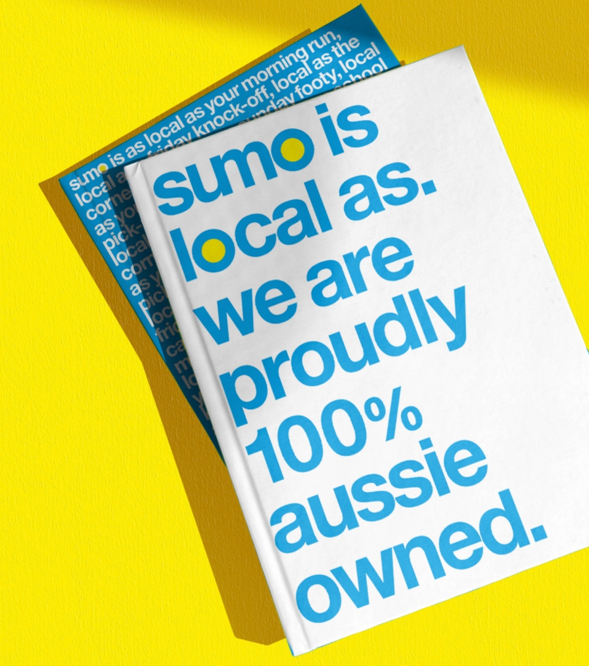
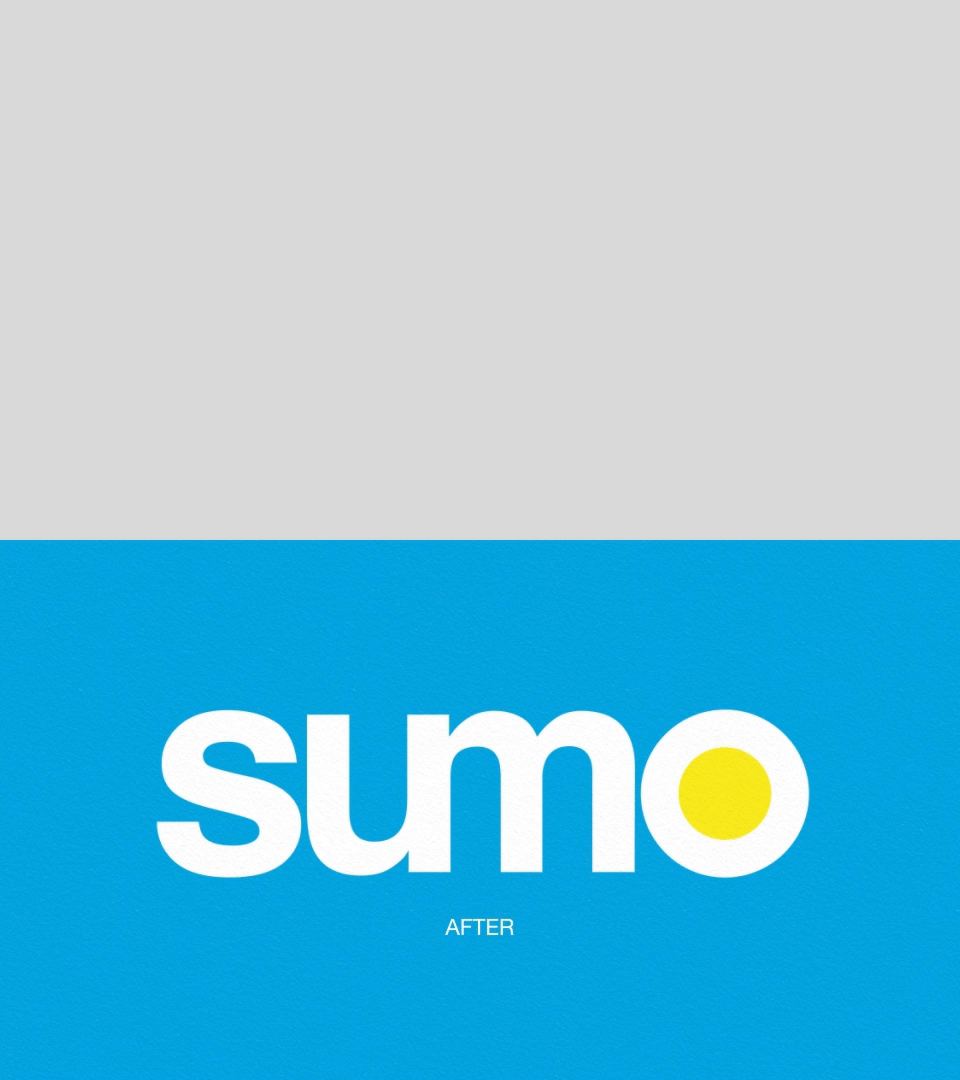
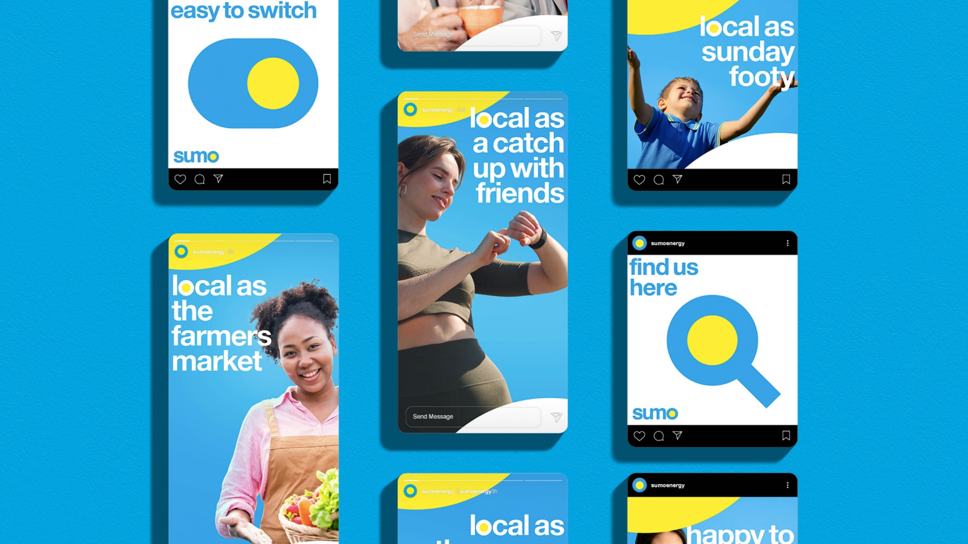
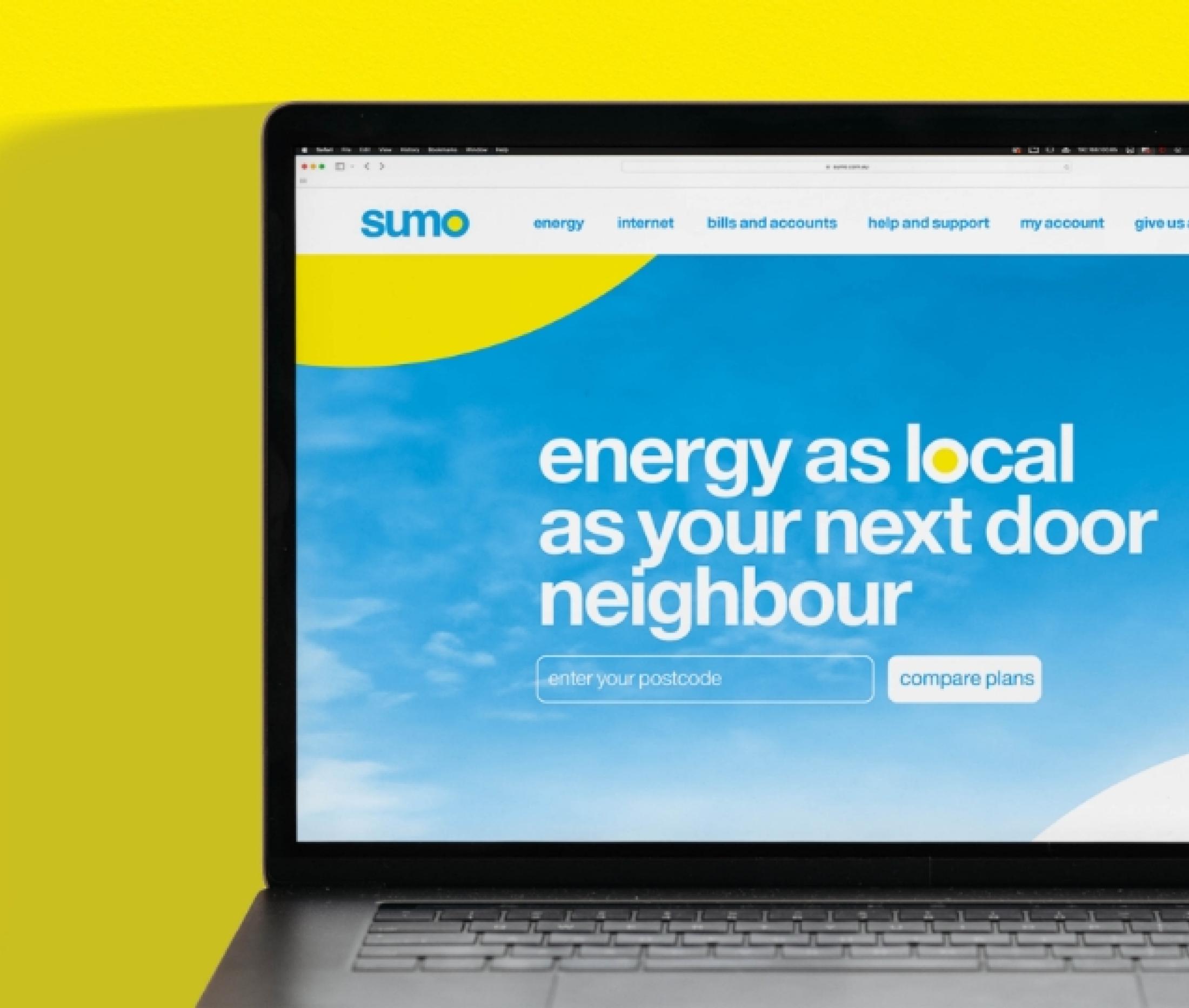
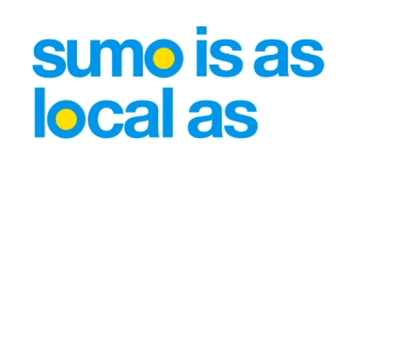
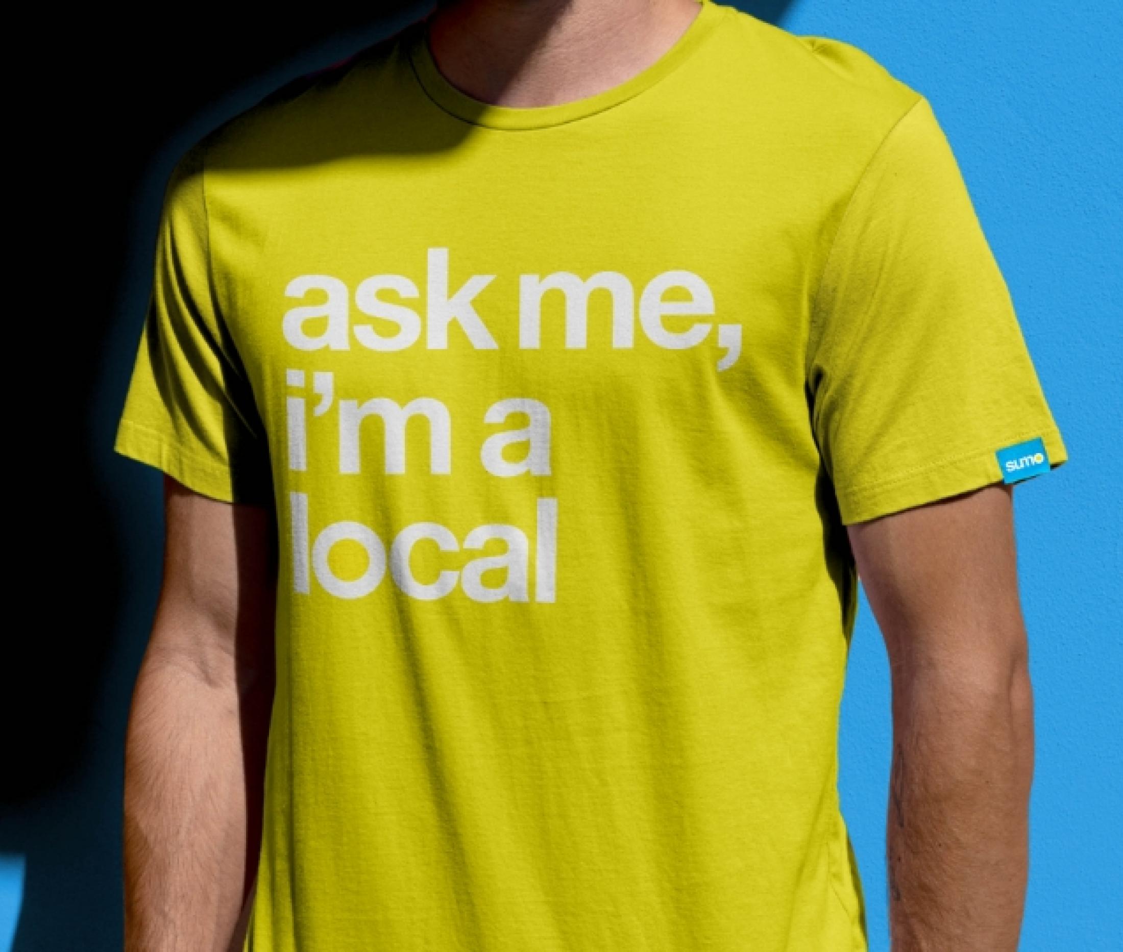
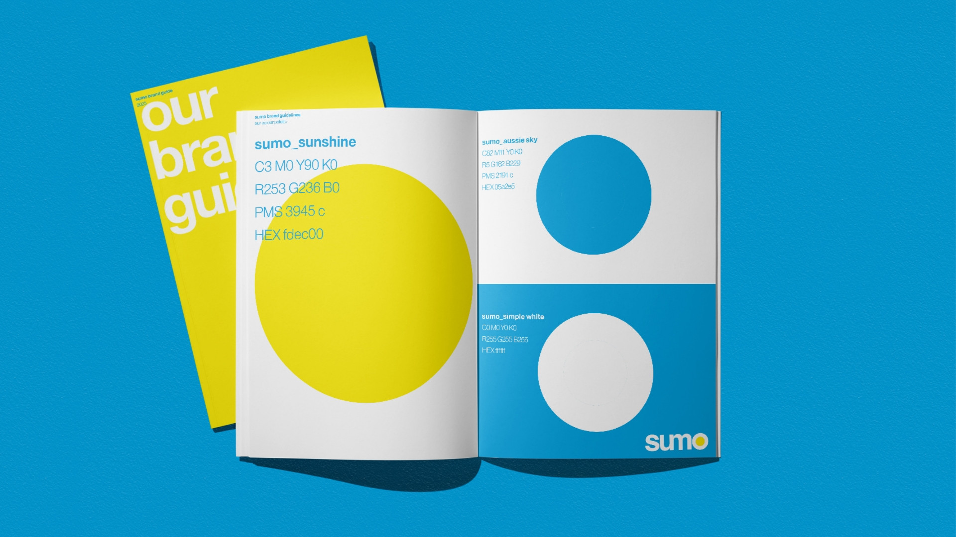
Partnering with The Edison Agency, Sumo set out to reignite its identity and reclaim its position as a true challenger. Deep strategic audits and workshops unearthed consumer insights and fresh opportunities, inspiring a bold yet grounded repositioning. The brandmark was reimagined, with the “O” symbol embracing the sun—a nod to its local Aussie roots. Clean, vibrant visuals, coupled with approachable photography, injected energy back into the brand while amplifying its authenticity and connection to community.
The result? A brand with edge, purpose, and clarity. Sumo now radiates confidence and trust, balancing its challenger spirit with a credible, consumer-first approach. Armed with a cohesive design system and a redefined narrative, Sumo is not just another energy provider—it’s a partner ready to lead with integrity, inspire loyalty, and disrupt the market once again.