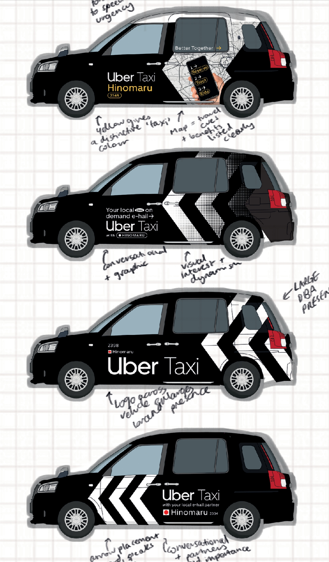
Uber, known globally for disruption and innovation, faced challenges in Japan where UberEats was more recognized than its e-hail service. To encourage trial and increase brand awareness for Uber's ride service, a high-impact visual branding solution was needed.
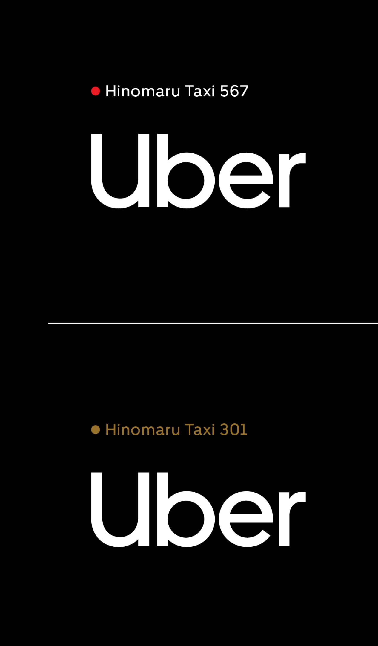
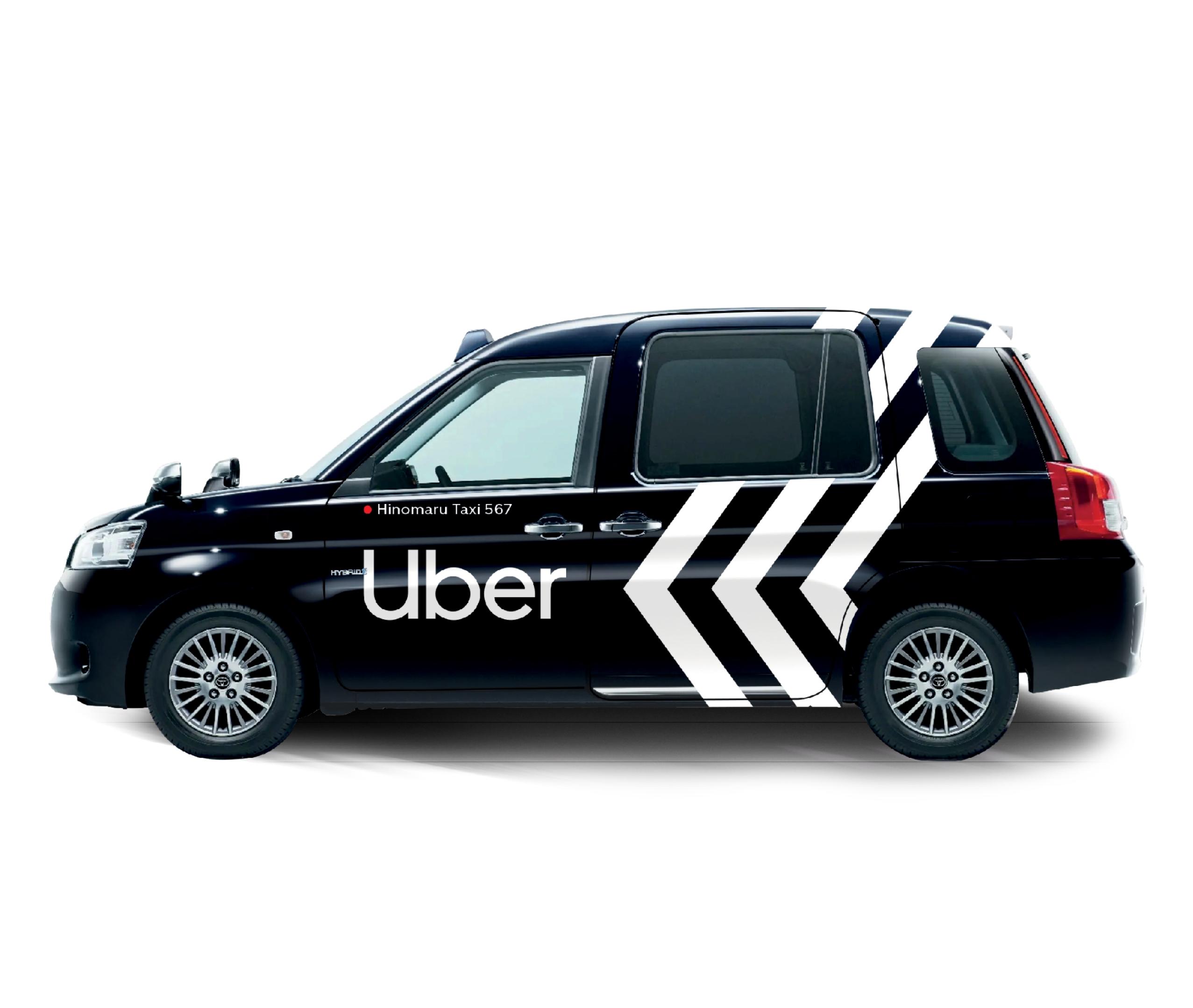
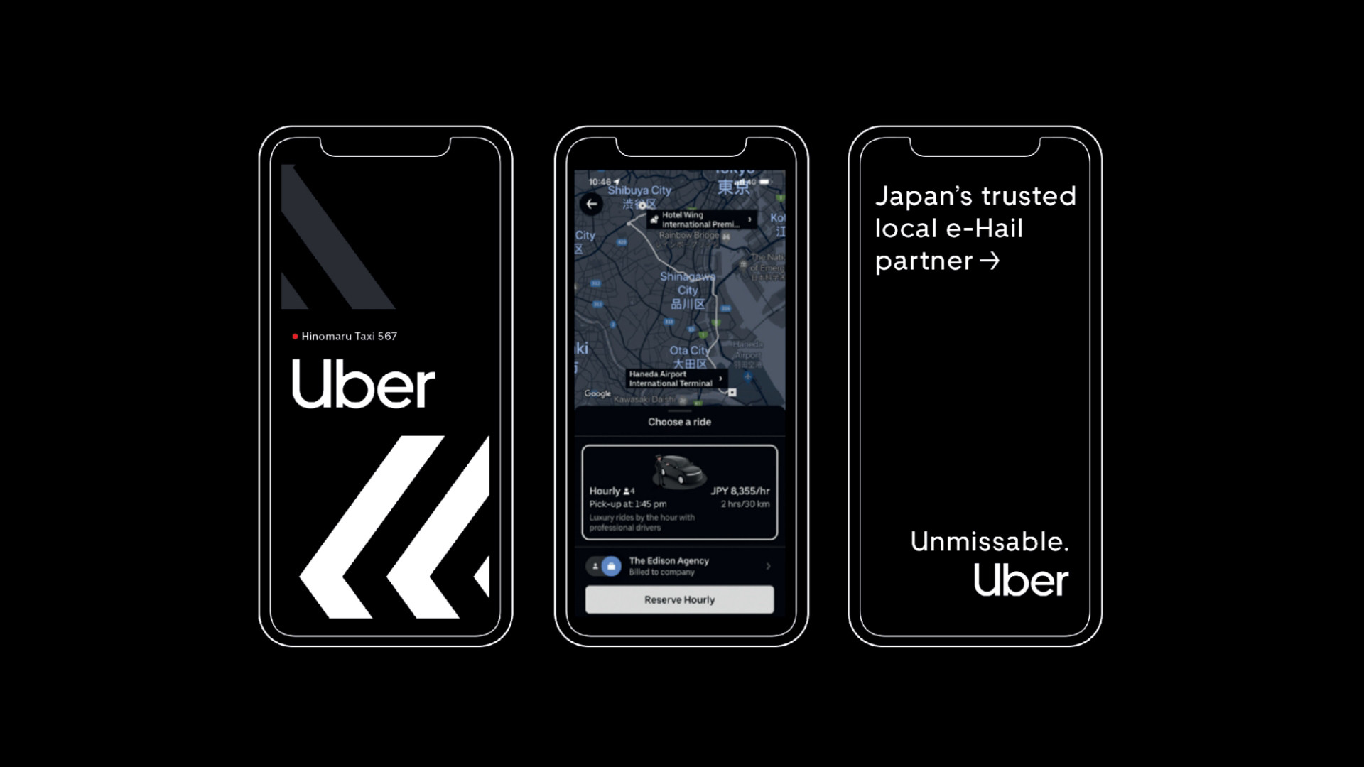
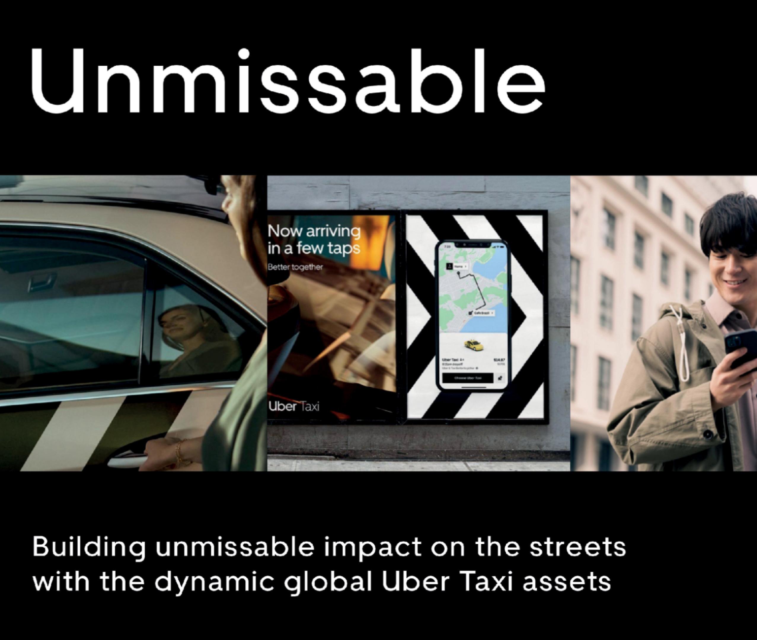
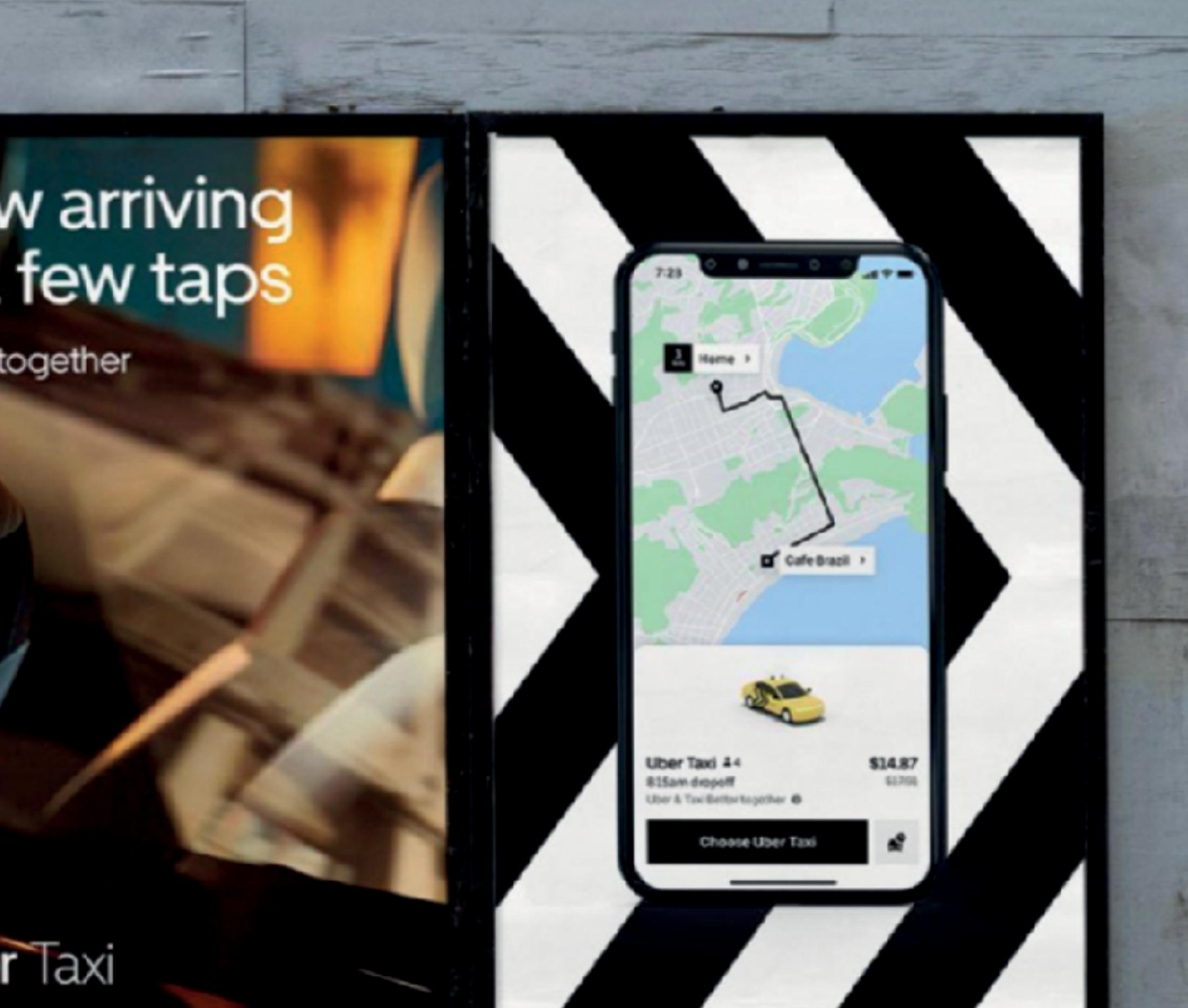
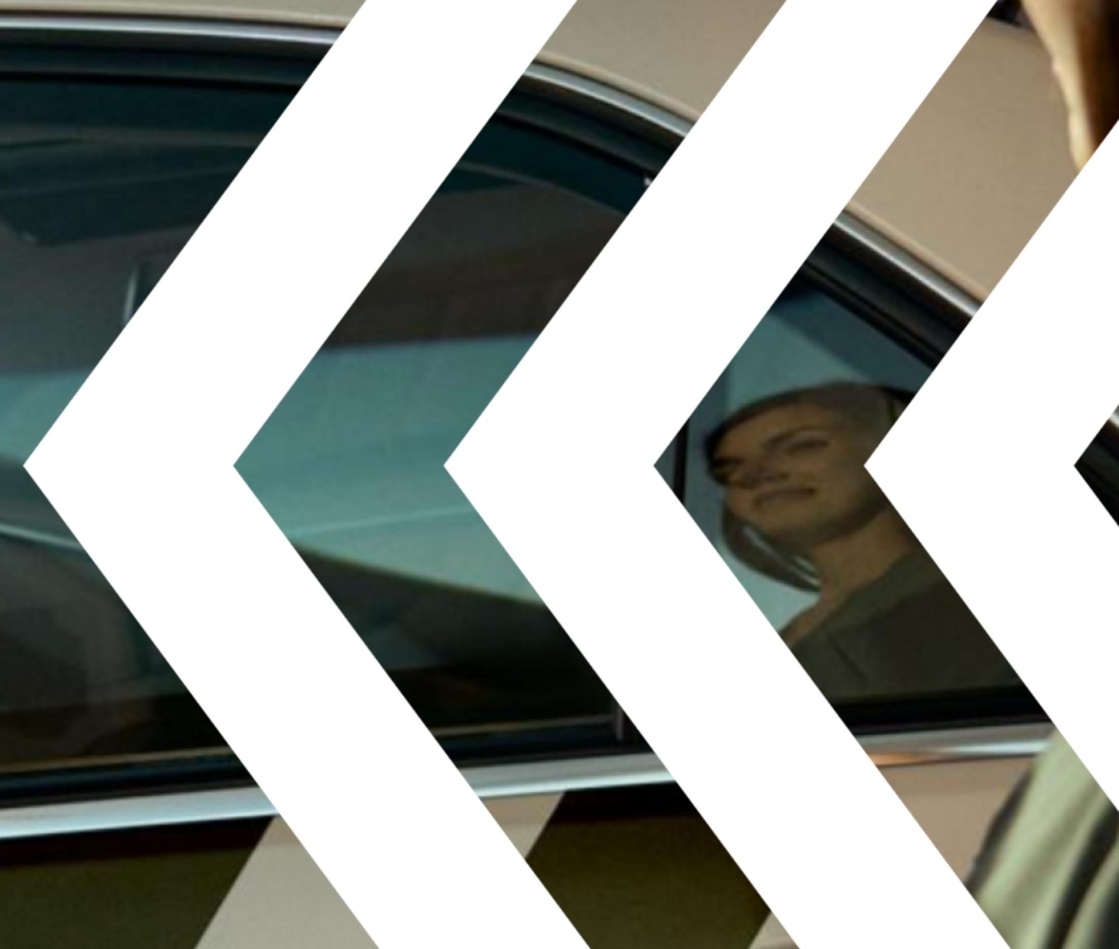
Uber Japan sought to uplift its e-hail service brand awareness amidst a competitive market and traditional street cab hailing. The goal was to create a design solution for Uber's vehicle fleet that would boost representation of Uber’s Masterbrand visual assets, integrate local taxi partnerships, and overcome legacy rideshare concerns. Utilizing Uber’s distinctive “Chevron” and brandmark, the design solution aimed for bold visibility and cohesion across all vehicles. The design needed to represent Uber as a software and convenience platform, highlighting the trust and reliability of local taxi partnerships. The Chevron was prominently displayed on each Uber fleet vehicle, symbolizing trust and forward movement.
The new design solution provided a bold and impactful representation of Uber in Japan. By balancing the Chevron with local taxi partnerships, Uber successfully increased brand visibility and consideration, reinforcing its position as a trusted, innovative convenience platform.
