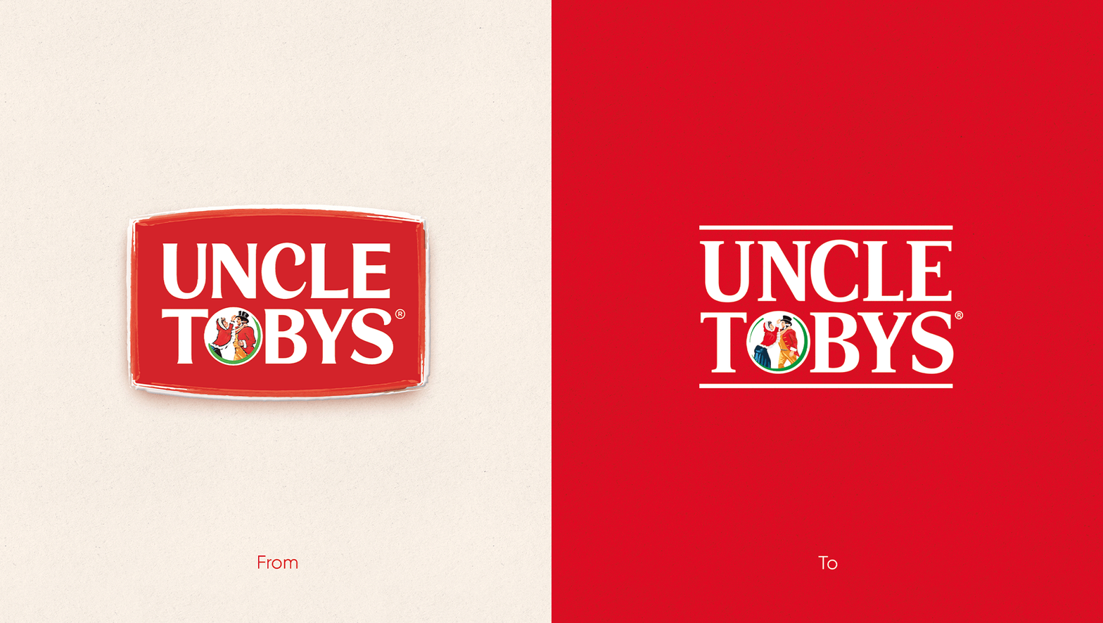
Since 1893 the UNCLE TOBYS brand has been a staple in Australian pantries. A brand synonymous with surf-lifesaving in the 80s, UNCLE TOBYS has always tapped into Aussie culture but like so many brands before it, what was old had become very uncool and unloved. The Edison Agency were tasked to rejuvenate the visual identity of the iconic Aussie brand as part of an integrated Masterbrand relaunch, designed to rethink and reinvent the brand to attract a new generation of oat lovers.
There’s a handful of Australian brands that have become part of our Australian fabric - in both culture and enterprise. Brands we all grew up wearing, seeing, eating, and drinking. Companies can’t buy this iconic status – it’s given to you by the people, a gift of thanks and recognition for hard work and ingenuity. Brands like Cottees, Arnott’s, Rip Curl, Qantas, Bonds, Sorbent, Vegemite – simultaneously nostalgic and ‘cool’; these brands truly feel like home.
Collaborating on the strategic direction for the brand with communication agency partner, Ogilvy, PR Agency Forward and London-based innovation agency Eat Big Fish, Edison created a bold step forward for UNCLE TOBYS. Designed to have impact far and wide - on trucks, in pantries, on silos and on digital and print advertising, the new brand system celebrates what people love and remember about UNCLE TOBYS.


